What if cats came to your visualization?

IMG_1938
Neko Atsume: Kitty Collecting Game

We have been discussing what we can learn about visualizations from gaming. One broad area is to look at how games use HUDs (Heads-Up Displays). Another is to look at how games use the time of the player. Perhaps the most unintuitive use of time is the postponement typical of various pet simulators and the recently popular and translated Neko Atsume: Kitty Collector game. In pet simulations like the Tamagotchi the chronotope is not the intense, fast, immersive experience of a first-person shooter, but the slow everyday rhythms and spaces of life. You carry the toy with you and feed your pet in real time. For periods you can’t do much unless you speed up the time. The play is in how you sustain play with small interventions over time. Imagine if we had visualizations that postponed gratification?

Read more

Watching Olympia: Visual Programming for Surveillance

visualprogramming
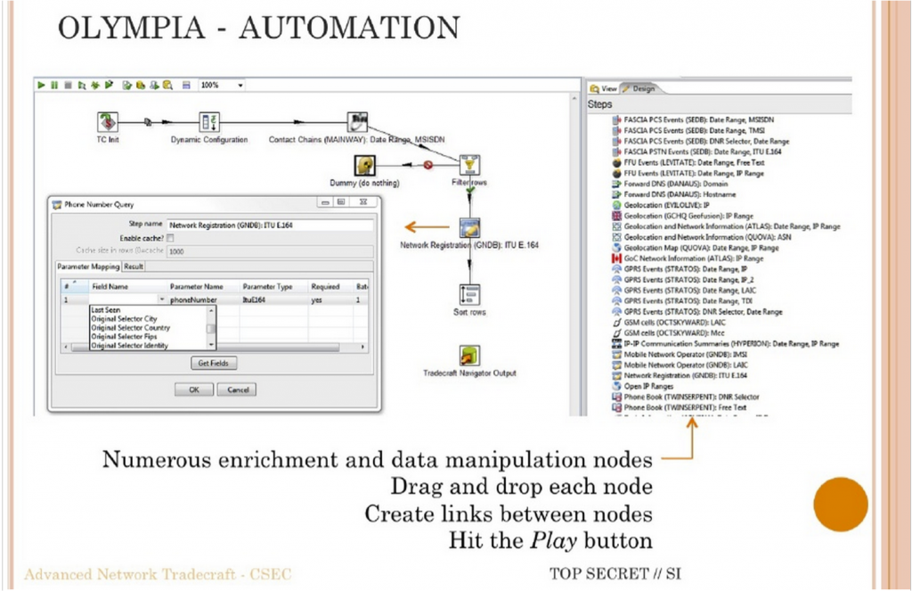
Olympia Visual Programming Slide

I (Geoffrey Rockwell) gave the May 12th lecture on the subject of visual programming languages (VPL). I started by providing a surveillance context for understanding why VPLs are developed to provide a way into programming. The context was the CSEC slide deck leaked by Snowden that shows the Olympia Network Knowledge Engine which allows analysts to access other tools from the 5-Eyes services. Olympia includes a VPL for creating “chains” that automate surveillance processes (see the slide above in which the VPL is introduced.) I argued that in many ways we in the humanities also do surveillance (of cultural history) and we pay attention to tools like Olympia developed to help analysts automate interpretative tasks. I also argued that we need to study these types of slide decks as examples of how big data analysis is conceived. These are the types of tools being developed to spy on us and manage us. They are used by governments and corporations. We need to learn to read the software and documentation of algorithmic management.

The heart of the talk was a survey of VPLs. I argued that we have had specialized formal visual languages for some time for describing wiring diagrams or signalling plans for train stations. These languages allow someone to formally represent a process or design. I then gave a brief history of visual programming and then turned to VPLs in the digital humanities. This connected to a survey of some types of VPLs as I wanted to go beyond the pipe-and-flow types of VPL. I then summarized some of the opportunities and challenges for VPLs in the digital humanities and returned to Olympia. VPLs only work when there is a community that develops and understands the semantics of their visual language. Wiring diagrams work because people understand what a line connecting two icons means and what the icons mean in the context of electronics. For visualization in general and VPLs in particular to work in the humanities we need to develop both a visual literacy and a discussion around the meaning of visual semantics. One way to do that is to learn to read VPLs like Olympia. Again, the humanities need to take seriously these new types of documents as important and worth studying – both PowerPoint decks (that are handed around as a form of communication) and software like VPLs.

Read more

Framing Visualization

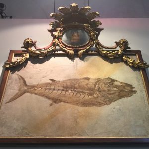
Historic specimen from the Natural History Museum in Verona

How are visualizations framed? As part of a design session we brainstormed about the ways visualizations are framed:

  • They are framed by texts like labels, legends, titles, captions, and other explanatory texts.
  • They can have links to other texts, other visualizations, or even help systems.
  • They will have controls that are part of the frame of the visualization itself. These controls are sometimes right in the visualization (direct manipulation) and sometimes in separate visual spaces.
  • They draw from data that you can sometimes see in other panels or get access to. The data can have different levels in that there could a corpus of texts and then a table of results of a statistical process that is then used to generate the visualization.
  • They are created by code which can sometimes be seen. You can see code in a visual programming system or spreadsheets. Some systems will show you the code that is running or give you a space to enter complex queries (which are a higher level of code that acts as a control.) In notebooks the code is visible too.
  • There will be a social frame of people interacting with the visualization and “consuming” it. They are made and used by communities whose diversity of values, positions, cultural conventions and mores are part of the conditions of their production, access, and reception. These community frameworks shape the design process. We tend to think of visualizations as being used by one person on a personal computer, but they also show up in presentations before groups of people, on television as part of a mediated presentation, on public displays and over the internet for others to look at. We need to pay attention therefore to the ways that groups of people share visualizations including the ways they show their screens to each other. Who controls group or public visualizations?

Read more

Visual Ideas for Visualization

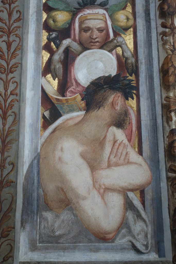
Fresco detail from San Maurizio in Milan

We have been gathering images like the Ole Wurm’s Cabinet that can inspire our thinking about visualization. I gathered some from my travels and share them here (see my Flickr account for more.) The image above is of a detail between chapels on the convent side of San Maurizio in Milan. Not only is it a humorous detail between “important” images, but it also shows someone leaning out and looking at the fresco. This reminds me of Johanna Drucker’s point about portraying the perspective of the viewer back into visualizations. Further, the image shows something common in church frescos: the painting of architectural (3D) detail that couldn’t be afforded. The architectural detail in turn has its own tradition.

I’ll be posting more images.

Visualizing a Thousand Years: On Jewish Cemeteries and the dH Situation

Martin Warnke presented the lecture on April 28th on the subject of: Visualizing a Thousand Years: On Jewish Cemeteries and dH Situation.

Warnke leads the Institute for Culture and Aesthetics of Digital Media and a research group on Media Cultures of Computer Simulation (German), both at the Leuphana University Lüneburg. He studies knowledge orders of the digital and simulation. His talk had three parts.

  1. First he looked at a dH project that is about visualization of a Jewish cemetery,
  2. Then he discussed the general situation of such projects,
  3. And he concluded by talking about dH in general.

Read more

Ole Worm Returns

olewurm

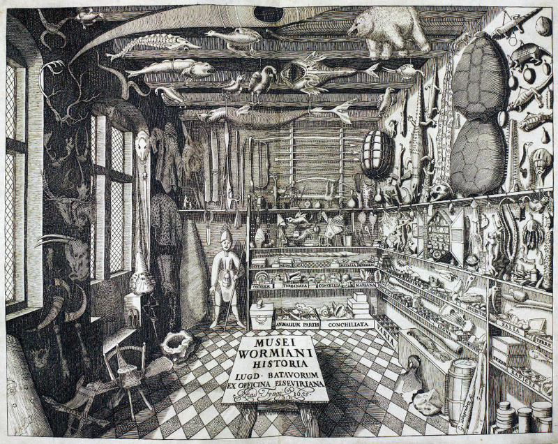
We have been gathering examples from the history of art and science and Johanna Drucker suggested the illustration of Ole Worm‘s Cabinet (above.) This image was the frontispeice to Museum Wormianum and it shows how much can be shown using space and tone.

I recently found that an artist has recreated the cabinet. See Ole Worm Returns: An Iconic 17th Century Curiosity Cabinet is Obsessively Recreated | Atlas Obscura.

Johanna Drucker: 3DH

Johanna Drucker gave the third lecture in the 3DH series. She talked about 3 dimensional digital humanities and how she conceives of the road ahead of us. She started with the goal of the project:

To develop a conceptual blueprint for next generation digital humanities visualizations.

What would that mean? How can we do it? To do this we need to understand where we are and where we have to go and her talk did that by touching on:

  1. How visualizations have an imprinted form of argument that comes from their origins.
  2. Understand ideas about languages of form – ideas about how one can systematize the visual.
  3. Look at how contemporary DH people use visualizations and what work do they want them to do.
  4. Understand conventions of pictorial imagery and how most visualizations are pictorially impoverished.
  5. Identify the epistemological challenges ahead.

She noted that 3DH is focusing on the visualizations of humanities documents and humanistic inquiry. Humanists are engaged in the production, interpretation, and preservation of human record. We need to think about problems of our practices like interpretation.

Read more

The Strange Attraction of the Graph

Screenshot
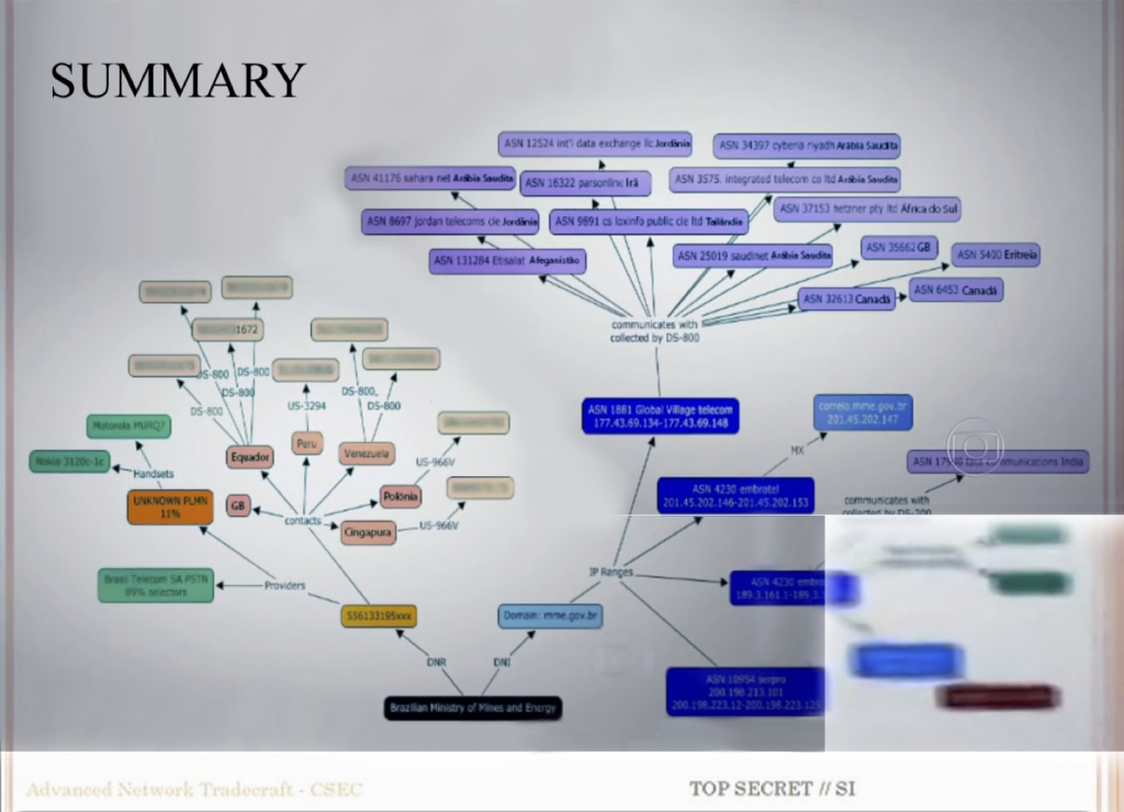
CSEC Summary Slide with Comm Network

I (Geoffrey Rockwell) gave the second lecture on Thursday the 14th with the title The Strange Attraction of the Graph (video). I started with the image above which is of a PowerPoint slide from one of the decks shared by Edward Snowden. This is the Summary of the CSEC Slides (see my blog entry on these slides) where CSEC showed what their Olympia system could do. The Summary slide shows the results of big data operations in Olympia starting with a target (phone number) and getting a summary of their telecommunications contacts. The image was not in the slides shared by either of the media companies (Fantastico or Globe and Mail) that reported on this as it has too much information. Instead hackers reconstructed it from video that showed it in the background. That gives it the particular redacted and cut-up quality.

I showed this slide as an example of a visualization we want to interpret. My talk addressed the question of how we can interpret visualizations like this, namely graphs in the computing sense of sets of linked points. I didn’t develop a general hermeneutics of visualization, or talk that much about this CSEC slide, but stayed focused on one type of visualization, the graph with nodes (vertices) and edges on a plane.

Read more

Visualization Paradigms – An Introduction: Second Thoughts on the Order of Things

Florian Windhager gave the first official lecture of the 3DH series on the subject of Visualization Paradigms. The lecture aimed to give us an overview of the field of information visualization and ran through a number of helpful distinctions.

He started with the simple story of visualization. We have the world, we do observations, these are ordered and then represented by science. We can represent in different ways, with language (text) or with symbolic representations (math) or with pictorial/iconic representations. Some of the common pictorial representations include maps and diagrams.

Read more

Erik Champion: Visualization and Games

Erik Champion, author of Critical Gaming: Interactive History and Virtual Heritage gave the first guest lecture for the 3DH project. Erik was originally an architect who now works in interactive history and digital culture. He has led a number of projects that adapt game engines for cultural heritage. He gave us a great tour of various 3D examples to encourage us to think of games and virtual spaces as visualization.

Read more