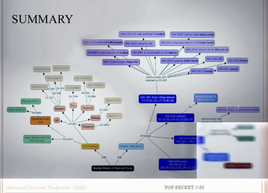
I (Geoffrey Rockwell) gave the second lecture on Thursday the 14th with the title The Strange Attraction of the Graph (video). I started with the image above which is of a PowerPoint slide from one of the decks shared by Edward Snowden. This is the Summary of the CSEC Slides (see my blog entry on these slides) where CSEC showed what their Olympia system could do. The Summary slide shows the results of big data operations in Olympia starting with a target (phone number) and getting a summary of their telecommunications contacts. The image was not in the slides shared by either of the media companies (Fantastico or Globe and Mail) that reported on this as it has too much information. Instead hackers reconstructed it from video that showed it in the background. That gives it the particular redacted and cut-up quality.
I showed this slide as an example of a visualization we want to interpret. My talk addressed the question of how we can interpret visualizations like this, namely graphs in the computing sense of sets of linked points. I didn’t develop a general hermeneutics of visualization, or talk that much about this CSEC slide, but stayed focused on one type of visualization, the graph with nodes (vertices) and edges on a plane.
Here are some of the approaches I took.
What is a graph?
It is important to draw on the traditions of computing to understand visualizations, especially if we want to understand how they are rendered by computers, how they are conceived by programmers, and how the tools work. For this reason we want to understand the basics of graphs. Graphs are representations of sets of points and their links. The simplest heuristic to interpreting a graph is to ask what the points represent and what the lines connecting points represent. That’s all there is to interpret in a simple graph which shows a set of nodes or vertices with edges between some of them. There is no information in the distance between nodes or their position on the screen; all that is generated by the tool based on rules about how to make graphs pretty and easy to read. (See the poetics below.)
I should add that a key heuristic to interpreting any visualization is ask what is metrical (based on a measurement in the data) and what is not. For example, in word clouds, the location of the word and its colour is often random while the size of the word and its centrality is based on the frequency. Many of the graphic features can have nothing to do with the data being represented which means it has nothing to do with the phenomenon the data comes from.
When rendering graphs a computer needs ways to represents the points, ways to arrange the objects, ways to represent the edges, and ways of decorating the background plane. The rules or algorithms used to determine how the points, lines and plane are drawn often have to do more with aesthetic choices than with some feature of the thing being represented. This can mislead us to overinterpret a graph.
What are some of the types of graphs?
The simple of idea of a network graph has been used in many familiar contexts to represent very different types of things from sentences to networks. We have traditions of using and interpreting them that are important to understand as interpretative expectations can bleed from one to another. Some of the types of familiar graphs that I showed include:
- Family trees where there are conventions of layering the nodes in generations. These use the layered location to arrange the generations of children nodes so you can tell where the third generation is quickly. We could say that these use a structured surface for the plane where most do not.
- More generally tree graphs usually start from one node and there is interpretative expectation that things evolve out from there. Examples might be trees of knowledge or trees of life.
- One particular type of tree diagram that is used in data representation are dendograms which show the clustering of things at different levels.
- In linguistics we see parse trees that show the parts of a sentence.
- State Diagrams are less familiar, but they and flow charts can show processes. John B. Smith used state diagrams for rhetorical moves in “Computer Crticism” (1978).
- Flow Charts can also help with making decisions (decision trees). These can be considered as part of a larger class of diagrams for reasoning with. Such diagrams don’t represent something that already exists, but they let you generate knowledge.
- Visual Programming environments are an extension of knowledge generating diagrams that allow one to “pipe and flow” data through simple processes.
- Radial charts are a form of arrangement that puts the points around a circle and then connect them with curves. TextArc (not really a graph, but worth mentioning) and Saklovskie’s NewRadial are examples.
- Arc Diagrams are another form of arrangement that puts the points on a line and then creates arcs between them. This can be used in timelines.
- Sociograms or social network graphs are in many ways the most important tradition and they go back to work by Jacob L. Moreno in the 1930s. They show the relationships between groups of people and are used in ethnography and sociology. They are important because they show us, people, in networks of relationships. They have come to form our imagination of how relationships can be shown. I compared this way of representing a relationship to that in a painting like David’s Death of Socrates. I showed a sociogram tool called RezoViz that we developed as part of Voyant. Here it is showing people and other entities in Humanist.
- Citation Networks show a particular type of relationship between academics – that of citation like this one of Comparative Literature 2004-14. Who cites who. What people or articles are central.
The Poetics, Ontology and Epistemology of Graphs
Poetics: Expanding on the heuristics for interpreting a graph mentioned above, it is useful to ask how the graphs we see are made (poetics.) What sort of data are network graphs typically used for? What sorts of algorithms are there for generating (rendering) the graphs. A good place to look for the algorithms and the aesthetics they encode is the computing literature and code libraries out there that people use. Di Battista et. al. in Algorithms for Drawing Graphs: an Annotated Bibliography (PDF) (1994) provides a great overview. He lists the aesthetics for attractive simple graphs as:
- display symmetry;
- avoid edge crossings;
- avoid bends in edges;
- keep edge lengths uniform;
- distribute vertices uniformly. (p. 7)
One of the ways these aesthetic guidelines are achieved with real code is to create a physics models of the data as a collection of rings connected by springs and then calculate and show the rings (nodes) in tension with each other. This is why network visualization tools often have sliders to control tension or how much nodes repel each other.
Epistemology: a large topic that I didn’t have time to go into, is how we make and then read meaning from visualizations in general and graphs in particular. This is obviously connected to the issue of the interpretation. I mentioned Ben Schneiderman’s Visual Information Seeking Mantra from “They Eyes Have It” (1996).
Visual Information Seeking Mantra:
- Overview first,
- Zoom and filter,
- Details on demand
This mantra is both normative and descriptive in that it is meant to capture how people read visualizations and therefore how you should design them. The idea is that users begin by getting an overview, then they zoom in and explore parts/relationships, and lastly they check details that interest them. We need to learn a lot more about how exploration works cognitively as compared to reading.
Another approach to the generation of meaning is to look at the graphical features (points, lines, plane) and how they are used for what. The assumption is that there is some sort of analogy between the linking of points and the real-world relationships being graphed. The graph creates a visual model of the abstract network of relationships. One can see how the imagination begins to dominate our conception. Relationships are not lines between solitary points, but that is how we have come to “see” them thanks to sociograms and other network graphs.
A direction I would like to take further would be to draw on how artists think of abstract art. I particular Kandinsky’s Point and Line to Plane strikes me as useful artist’s view on the use of these graphic primitives. For example, he makes a point about External and Internal Experience. One can experience something from outside it (as if through a window above it) or one can experience it inside the phenomenon.
Ontology: connected to the epistemology of the graph is the ontology. What are graphs and what do they represent. I argued that they are models of models. They are representations of data sets, not of the thing studied. The datasets in turn are measurements or observations of the thing studied. Sometimes there are intermediate models giving us layers on layers. The point is that they show interpretations not the thing. This is a point Moretti makes and Smith actually theorized in 1978 in his structuralist “Computer Criticism.” One could say that network graphs pretend to show the underlying structure of the phenomenon and that is part of their attraction.
Interestingly graphs are not necessarily quantitative. One can represent with a graph a table of friend’s names and whether or not they are friends. All the cells are names and interpretations of friendship entered by hand. There is no quantitative, only categorical data.
Why the attraction?
This brought me back to the title and the attraction of the graph. This part was more speculative. Some reasons why network graphs in general and the CSEC one in particular are attractive include:
- Simple graphs are simple – just points and lines. This leave lots of room for the imagination to see things into them and to explore them into significance.
- Visual exploration of a rich graph feels much more open and free than following a sequence of statements as one might find in a text, syllogism, or code which is read in a linear way. They feel like they can be consulted rather than having to be read end to end.
- They show time in the space of the plane. Everything that might be complex and hidden in time is arranged out on the planar screen to be seen in one glance.
- Another way to put this is that they provide both overviews and then details. There is something attractive to the way one can explore a rich graph.
- Or we could say that time (and distance) are collapsed into and abstraction for the screen.
- This puts everything into an arrangement for a gestalt view where you have the impression you can see the whole. You can grok it! which establishes yet another connection, this time between you and the visualization.
- One of the things compressed is the process of generating observations and then the visualization. The messiness is hidden in the white box – the black box you don’t even know is there.
- Finally, the network graph has become the visualization of the networked age. I showed early and later graphs of the internet, graphs of communication and how computers work, graphs of network cables, ontological graphs and graphs of surveillance software architecture. The graph is the form with which we imagine virtual culture. It is a form without distance (time) or position (space). It is the simplest form of abstraction.
Of course, it also has little to do with the material form of computing or networks or software, but that is the point of the virtual. It approximates the way we imagine pure abstraction.
As for the communications graph I started with, it had further attractions as it had traces of its generation (time) and redaction. It has a context which can be unpacked from this visualization. In this way the graph is far richer than most graphs that hide all the messy.
What makes an attraction strange? I didn’t have time to explain my title, but the idea of an attractor in systems is that it is something towards which they evolve. I was using the term metaphorically for the way we can feel there is an interpretation that acts as an attractor pulling us towards the emergence. The attractor can be felt as a hidden structure that attracts the arrangement of the visualization. This sense that there is an attractor operating on us in visualizations is what is strange. For that matter the attractors are strange. They don’t exist in the sense of some underlying truth which we get closer to in certain visualizations, but we are driven to keep on trying as if attracted to their flame.
What are some guidelines for design?
The problem with network graphs is that it is easy to overinterpret them. I was asked during question period if I had suggestions for how to design network graphs that would be hermeneutically more robust. Here are some of the ideas I put forward:
- Provide controls so the user can play with the visualization and see that there is no right arrangement. Controls also give some representation of the user’s perspective making the point that all visualizations are from a perspective.
- By extension one can animate the graph as many based on physics models are. The nodes can move around on their own as the springs bounce them around. This makes it clear there is no objective arrangement. The user can also drag stuff and watch what rubber bands pull what else. This manipulation is not only satisfying, but it helps the user understand what is based on the observations and what is a rendering decision.
- Present the graph with other linked visualizations that let the user see different and conflicting views onto their data. For humanists it is also a good idea to give them access to the “original” text or metadata so they can use other reading methods to see if there are reasons for the patterns being seen. This is an example where giving details allows intuitions to be checked in ways that humanists are comfortable with.
- I closed by showing a Mathematica notebook where I could show the code with the visualization. The notebook is a form of meta interface which visually arranges text, code and results in a way that is supposed to recall the scientist’s notebook. This means that any visualizations (even interactive ones) are woven together with their code. This way you can see the logic of the rendering.
- Reflecting later I wondered if Kandinsky’s point about internal experience couldn’t be revised into a guideline – namely that visualizations should look as if they are viewed from inside the experience. This would mean that it is clear that not everything can be seen (lines might always lead off the screen).