Leif Isaksen gave the lecture on the 16th of June. He has a background in history, computer science, philosophy and archaeology. He spends a lot of time thinking about how to represent complex spatial arguments to other people and that has led him to ask how can we read (closely) the historical depictions of geographic space? How can we approach someone else’s visualization when we have only the visualization. He then joked that a better title for his talk might be “Thoughts on Predicting the Ends of the World” where “ends” can mean goals in representing the world.
Some of the things we have to think about when reading historical visualizations include:
- Classification – how is the world classified when the visualization was drawn up?
- Derived vs manually produced data – how did the data get to the cartographer and, for that matter, how did the map get to us?
- Graphic vs. textual representations – we are continually transforming representations from visual to textual and back – what happens in the transcoding?
- Epistemology – how do we know what we think we know?
- Time and change – how is time and change collapsed in representations of space?
- Completeness – we never have complete information, but sometimes we think we do
- Data proxies – we are not interacting with the phenomenon itself, but with surrogates
- Geography – what is special about the world?
He then showed 4 case studies.
Case Study 1: Roman Itineraries
Roman “station lists” exist that tell us about the stations if you went from somewhere to somewhere. There are a number of these lists, but we don’t know why they were created or stored. He showed an image of the Vicarello Goblets.
Then he showed ways to put these itineraries on a map or to visualize them in other ways like a topological map. A topological map can show closeness or betweeness. High betweeness is where you might get a bottleneck of travelers.
He showed that the data for itineraries has been put into databases for others to look at like that of the Ancient World Mapping Center. When we look at them the beginnings and ends of itineraries are often strange.
Leif commented that we need to be careful when drawing conclusions from small sets of data (like these lists) or combined data from different sets (and lists). We need to remember that the texts or lists are not the phenomenon. Access to texts is also changing rapidly.
Case Study 2: Ptolemy’s Geography
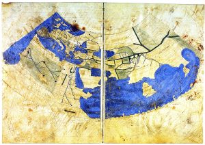
Ptolemy was famous early on for astronomy and geography. His Geographia was one of the earliest tools for geography. Ptolemy wrote about projections and provided a catalogue of places with coordinates that could be projected. We don’t have his maps, though we have maps created from his Geographia, to get those we try to project them from his theory and coordinates. (See Leif’s paper on Lines, damned lines and statistics: unearthing structure in Ptolemy’s Geographia (PDF).)
Leif showed a graph of the coordinate values that represented points in terms of time. Latitude is tied to length of longest day, but it isn’t even. You get an uneven grid. The coordinates of boundary locations seem to fall on the irregular time-based grid network. It is as if the edges of regions are meant to fall on the hours of the degree based system. It looks as if alignment was important to him – he seemed to have believed that alignment should be the case like grain in wood.
Leif talked about how Ptolemy’s data can tell us things about his theory. He talked about the warp and weft of the data. It is also important to see how visual arguments help us understand numeric ones at scale. The visual projection shows us something about Ptolemy’s coordinates (numbers).
Finally, Ptolemy is interested in mapping the world to the celestial which means he has to know the time.
Case Study 3: The Peutinger Map
The Peutinger map was his third case study. It is a copy of a map that we are fairly sure was produced in late antiquity. It is a weird parchment scroll that is long, but not high. Is it a guide for carrying on a trip? Rome is somewhere in the middle but not exactly in the middle which has led people like Richard Talbert in Rome’s World to argue that the long map was a presentation piece and Rome should be in the middle which means we are missing three parchments on one side.
Leif runs a project called Pelagios Commons which allows him to compare locations in the map to those from other itineraries (lists). The itineraries on the coast lines of the map seem similar to another work. He argued in support of Talbert suggesting that the scroll may have been copied from a wall.
This led to the general warning that the way that data is experienced and consumed is often very different now from how it was intended to be consumed and contextual evidence can come from other unexpected places.
Case Study 4: the Pelagios Map Tiles
Pelagios is aggregating information from early geographic documents. He showed how we need to be careful about flat maps – they can hide information. When you look at the 3D then you can begin to understand some of the flat decisions – like why you need to skirt certain mountains or wet areas (like the Po valley.)
Conclusions
Contemporary datasets are just like the old ones. They are composites, each with a long and complex heritage. They are incomplete and degraded. They need to be read closely and distantly. They need to be challenged just as we would any other type of evidence or claim.
He ended by saying that the point of the humanities is not to find answers so much as to question that answers we have been given. We need to rethink what we thought we knew and that includes visualizations.