DHd2018 in Cologne!

It’s about time for a new blog post! 3DH has progressed quite a bit in the last couple of months. We fleshed out wireframes based on the conceptual foundations that came out of the workshop in Montreal, iteratively refined them and finally brought the concept to an interactive prototype level that we were able to present at the DHd2018 conference in Cologne.

hauptscreen11_border

After the Montreal workshop we focussed on the classic close reading scenario with an emphasis on interpretation because it can be considered the one to which 3DH postulates apply the most, so we wanted to make sure we cover that first: Exploration of free annotations to sharpen the literary research question.

Developing an early prototype as a proof-of-concept for this scenario first would make it easier to transfer interface principles to the other scenarios, so we reasoned. Over the course of the last months we chose a text we deemed appropriate for the prototype and for the intended audience and populated the scenario with real data. The text we wanted to annotate needed to fulfill some basic requirements: It should be well-known, so people can relate to it. It should be complex enough, so different paths of interpretation can be pursued and it should be short enough, so people can actually read the text without spending too much time, if they want to. It should also be long enough, so visualization as a method of getting an overview really makes sense. We picked the short story In der Strafkolonie von Franz Kafka.

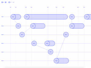
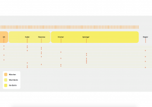
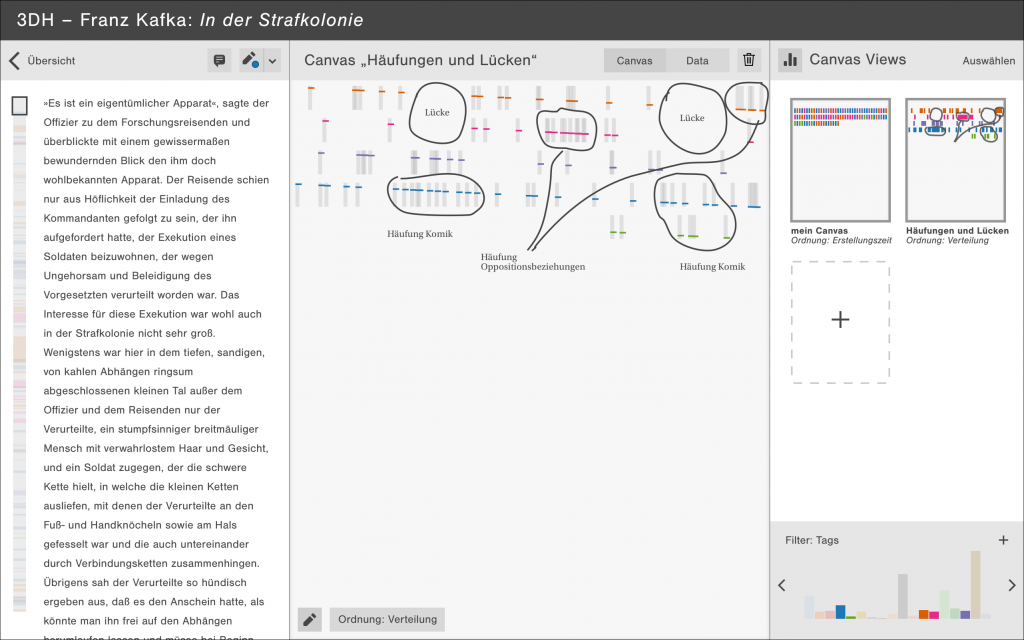
For this short story we created over 600 annotations in 19 different interpretation categories in Catma. In the next step we exported our Catma annotations as JSON and built a web-based demonstrator with Javascript and D3 that shows the most important interactions of the concept.

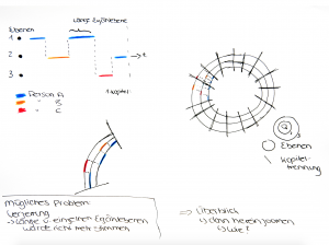
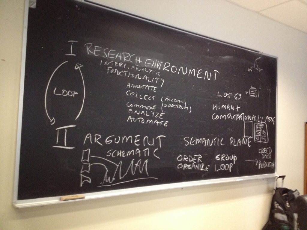
The main principles of our concept are the tripartition of the interface and the representation of annotations as glyphs. So, while we clung to the idea of glyphs (mentioned in the last article), we have abandoned the idea of a strict spatial separation between the two activity complexes research and argument. We came to the conclusion that scholarly activity is better represented by three adjustable spaces text, canvas and argument.

Here text is simply the part of the interface, where our research text can be read and annotated. For each annotation a glyph is created on the canvas in the middle of the interface. We can sort these glyphs, structure them according to different criteria and draw connections between individual or groups of glyphs. Scholars can save multiple canvasses each of them highlighting a particular aspect of the text. In the argument space on the right side of the interface these canvasses can be combined and arranged to form an argument.

Since this year’s topic of the DHd2018 conference was critical perspectives on digital humanities, our contribution put an emphasis on our design process and the accompanying design-based critical perspective we have applied in the process. We talked about how we incorporated the four methods scenarios, wireframes, prototyping and design reviews into our process and how these helped us to gain new insights and arrive at the current state of design.

Here’s a link to the early prototype that allows you to explore the interaction between annotations and glyphs:

Prototype

You can find our slides here:

Slides

These two videos show the interplay between the three parts of the interface:


3DH Workshop in Montréal

Prior to this year’s DH conference in Montreal, Canada (8 – 11 August) some of us flew in a little earlier to come together for a workshop in the context of the 3DH project. Apart from the core project team and our colleagues Evelyn Gius and Marco Petris we were joined by our associated members Johanna Drucker, Geoffrey Rockwell and Marian Dörk as well as Laura Mandell.

Over the span of two and a half days we had an intense and productive workshop that had the goal of refining and reifying the three concepts we had developed so far over the course of the last weeks. Springboards for this process were on the one hand our four conceptual 3DH postulates: 2-way-screen, parallax, qualitative and discursive, on the other hand reflections about supporting the process of interpretation in digital tools. We specifically discussed the relevance of the article “Thinking about interpretation: Pliny and scholarship in the humanities” by John Bradley.

What is intriguing in the software “Pliny” described by Bradley, is, that scholars are very not bound in the way they organize their notes and annotations, there is no need to assign distinct categories or relations to them. Instead, these can be organized on a plane and emerging structures becoming apparent can be inscribed by encapsulating them in boxes, when the interpretation progresses.

This appears to be a way of modelling interpretative data that takes into consideration methods scholars have been using in the analog world, however, also exceeds that and opens up new possibilities enabled by the digital (in terms of interaction with and visualization of data), an approach that seems very much related to the goals of the 3DH project as well.

In our design process so far we have based our concepts on real-world scenarios fed by experiences of literature scholars in research projects and arrived at similar conclusions as Bradley: It seems counterintuitive for scholars to force them to apply structure to their annotations when they start with their process. Relations between and qualitative statements about annotations often can only be made when the process has progressed.

When we discussed the wireframes in the workshop we realized that we can differentiate two different environments or spaces of literary scholarly work: Johanna called this research and argument space. While we define typical descriptive acts of the scholarly process like annotating, collecting and commenting as research activities, we consider tasks like grouping, ordering and organizing as interpretative or at later stages  argumentative activities. Usually scholars switch between activities of either of the modes perpetually.

img_2222Interplay between research environment and argument environment (by Johanna Drucker)

We understood that this circumstance has to be supported by the interface much more deliberately. Thus, for the next steps in the design process we will focus on the representation of and interaction between these spaces in the interface. What would an interface look like that supports continuous switching between these mentioned activities?

In the discussion we came up with the concept of a semantic plane that might allow us to bring these two spaces together. While we would produce annotations in the research phase that would be represented as glyphs on the plane, in the argument phase we would position and manipulate these glyphs to assign meaning to them and create  arguments that we later can publish.

Merken

Merken

Merken

Merken

Merken

Getting more specific: Refinement of our narratological use case(s)

Second Co-Creation-Workshop in Potsdam May 31st, 2017

We are halfway through our lecture period by now and since our first co-creation workshop in Potsdam at the end of April a lot has happened.

The concept sketches that were created by our five student groups during the first workshop were elaborated on in preparation for the next exchange between Hamburg and Potsdam.

On May 10th, Marian Dörk and I, together with the Potsdam interface design students, visited Chris Meister, Rabea Kleymann and the other members of the team to join Chris’ seminar and the accompanying exercise.

In the seminar Chris gave an introduction to the collaborative annotation tool Catma and explained to the Potsdam students, how you would use the tool with a certain literary question in mind. This introduction was meant to serve as a primer to Catma on the one hand, but also as an insight into the literary scholar’s process. Since the Potsdam students are supposed to base their visualizations on real data, i.e. narratological annotations produced in Catma, we deemed it necessary to make them comfortable with the process and the tools. The annotations they will eventually use, will be produced and made available to them by the Hamburg students via Catma.

In the exercise the interface design students presented their refined concepts in front of the Hamburg students and Chris Meister’s team. The concepts were quite diverse, in terms of narratological questions they were supposed to address, as well as media, technology and design. The images depicted below give an impression.

bildschirmfoto-2017-06-07-um-17-30-42 bildschirmfoto-2017-06-07-um-17-28-48

bildschirmfoto-2017-06-07-um-17-27-52bildschirmfoto-2017-06-07-um-17-39-31
Sketches from short presentation in Hamburg

The predominant issues addressed with the concepts were, among others: narrative levels, advanced text search, narrative polarities and relations between objects, characters and parts of the text. After each presentation the literary scholars gave feedback on the projects. In the following three weeks the students had time to continue working on their concepts, before the two student groups from Hamburg and Potsdam got together again.

On May 31st our second co-creation workshop took place at the University of Applied Sciences Potsdam. The goal of this workshop was to sharpen the students’ concepts with respect to their ability to help answering narratological questions.

Read more

Visualisation of literary narratives: How to support text analysis with visualisations? – Creating a narratological use case

 First Co-Creation Workshop in Potsdam, April 26th, 2017

The 3DH project aims to lay the foundations for a ‘next-generation’ approach to visualisation in and for the Humanities. As for the theoretical background, the project’s frame of reference are the particular epistemological principles that are relevant to hermeneutic disciplines and which must therefore also orientate our approach to visualisation.

For the 3DH visualisation concept we formulate four postulates. These are

  1. the “2 way screen postulate” (i.e. an interaction focused approach toward visualisation);
  2. the “parallax postulate“ (i.e. the idea that visualisation in and for the humanities should not just tolerate, but actively put to use the power of visual multiperspectivity in order to realise epistemic multiperspectivity);
  3. the “qualitative postulate” (i.e. the idea that visualisations should not just ‘represent’ data, but also offer a means to make and exchange qualitative statements about data);
  4. the “discursive postulate” (i.e. the idea that visualisations should not just be used to illustrate an already formed argument or line of reasoning, but should also become functional during the preceding/subsequent steps of reasoning, such as exploration of phenomena and data, generation of hypotheses, critique and validation, etc.).

During the 2016 summer term we organized a public lecture series on DH visualisations (see also 3DH blog and  https://lecture2go.uni-hamburg.de/l2go/-/get/v/19218).

One outcome of the lecture series was a need for bringing in the expertise of visual design specialists. By bringing together the “two worlds” of literary studies and visual design we hope to transcend the limitations of our respective visual(ising) routines.

Co-teaching seminar University of Applied Science of Potsdam and University of Hamburg

In the 2016 summer term we have begun to engage in a co-teaching project with the visual design specialists Marian Dörk and Jan Erik Stange from the University of Applied Science Potsdam. Two groups of students meet during four workshops alternately held in Potsdam and in Hamburg, one a class of German literature master students (Prof. Chris Meister, Universität Hamburg), the second a class of design students (Prof. Marian Dörk).  Their joint goal is  to answer two questions:

  • ‘In how far can visualisations be helpful for the analysis of literary texts?’ and
  • ‘Where do visualisations have their place in a subjective and interpretive structure?’

The literary text under discussion is the novel Johannisnacht by the German author Uwe Timm, published in 1996. It tells the story of a writer suffering from writer’s block, who gets the opportunity to write a report about the history of the potato.

Read more

VIS2016 – K. Coles: Show ambiguity

This is the first post in a series of posts about what I think to be most relevant for 3DH from the IEEE VIS2016 conference in Baltimore.

The poetry scholar Katherine Coles gave a presentation on Poemage at the VIS4DH workshop at VIS2016. Poemage is a tool for exploring and analysing the sound topology of a poem. It is an interdisciplinary work between poetry scholars, computer scientists and linguists. Recommended reading is not only the presented paper Show ambiguity, which takes a more poetry scholar influenced perspective on Poemage but also the companion paper which complements “Show ambiguity” by adding the computer scientist stance to it. Besides the methodological principles that are covered by Poemage both papers give also great insight into the collaborative aspects of the project across disciplines.

poemage

The UI of Poemage offers three views. The Set View offers rhyme sets, which are sets of words that are connected by a specific rhyme scheme. The rhyme sets are organized by rhyme types. Each circle represents a specific rhyme set. The size of the circle depends on the number of words in the set. The Poem View shows the poem in its original form and the Path View gives a 2D space where the flow of the poem according to its rhyme topology is displayed. Each node in the path view represents a word in the poem and is positioned in relation to its position in the layout of the poem. The curves show the flow of a rhyme set through the poem. The views are linked by color coding and by interaction: e. g. selecting a rhyme set in the Set View also activates the visualization of that rhyme set in the other two views.

I like especially the openness of the tool. It supports and encourages multiple readings and the rhyme types are extensible in two ways. The simple way allows the scholar to group words freely to form custom sets without being bound to any predefined rhyme type. The more complex way allows the scholar to access the underlying rules engine or formalism to formulate new rhyme types in a notation which is geared to poetry scholars.

The representation of rhyme sets as paths allows exploration of the rhyme topology by examining spatial phenomena of the paths like intersections, mergings and divisions. There is a tight link between the visualisation and the poem that makes it easy to trace back observations in the visualization to the original data.

Another interesting aspect of her talk was when Coles shared her view on the humanistic idiosyncrasies of data visualization, especially in poetry scholarship. She wanted Poemage “to provide an aesthetically enriched experience” and emphasized the engagement between scholar and object of study which should extend to the visualization as well.

When we discussed the special needs for the humanities for visualization in the 3DH project so far, I (with a computer science background) was very sceptical about seeing the humanities on one side and the hard sciences on the other side. On the contrary I can see a lot of common ground between a physicist and a humanities scholar exploring and interpreting his or her data with visualizations. Instead of seeing the two as opposites we in 3DH started to work with a methodological continuum between the poles of subjectivity/uniqueness/particularity and objectivity/reproducibility/universality. I doubt that the kind of engagement Coles describes is the same engagement between a physicist and his or her data. I think Coles managed to describe at least part of the possible contribution of visualisation to one extreme of that continuum. And this really helps to track down the methodological differences 3DH visualizations need to account for.

Lauren F. Klein: Speculative Designs: Lessons from the Archive of Data Visualization

Peabody Visualization

Lauren Klein‘s paper looked at two 19th century pioneers of data visualization to see what we could learn from them. She asked,

What is the story we tell about the origins of modern data visualization?

What alternative histories emerge? What new forms might we imagine, and what new arguments might we make, if we told that story differently?

Lauren looked at Elizabeth Peabody for an alternative history who is often overlooked because her visualizations are seen as opaque. She compared it to Playfair who is generally considered the first in the canonical history of visualization. Lauren asked why visualizations need to be clear? Why not imagine visualizations that are opaque and learn from them? Her project is a digital recreation project of Peabody’s thinking.

Read more

Stan Ruecker: The Digital Is Gravy

Timeline Design
Timeline Design

Stan Ruecker gave the 3DH talk on the 23rd of June with the enigmatic title The Digital Is Gravy. He explained the title in reference to gravy being the what gives flavour to the steak. In his case, he wanted to show us how physical prototyping can give substance (steak) to the digital.

Stan started with an example of a physical prototype that materializes bubblelines that was developed by Milena Radzikowska who showed it at Congress 2016 in Calgary. (See Materializing the Visual.) He suggested that materialization of a visualization slows down analysis and leads to other lines of thought.

At the IIT Institute for Design Stan is weaving physical prototyping into digital design projects. His main research goal is to find ways to encourage people to have multiple opinions. He want to build information systems that encourage the discovery of different perspectives and the presentation of multiple opinions on a phenomenon. The idea is to encourage reflective interpretation rather than dogmatism.

Read more

Leif Isaksen: Revisiting the Tangled Web: On utility and Deception in the Geo-Humanities

Leif Isaksen gave the lecture on the 16th of June. He has a background in history, computer science, philosophy and archaeology. He spends a lot of time thinking about how to represent complex spatial arguments to other people and that has led him to ask how can we read (closely) the historical depictions of geographic space? How can we approach someone else’s visualization when we have only the visualization. He then joked that a better title for his talk might be “Thoughts on Predicting the Ends of the World” where “ends” can mean goals in representing the world.

Some of the things we have to think about when reading historical visualizations include:

  • Classification – how is the world classified when the visualization was drawn up?
  • Derived vs manually produced data – how did the data get to the cartographer and, for that matter, how did the map get to us?
  • Graphic vs. textual representations – we are continually transforming representations from visual to textual and back – what happens in the transcoding?
  • Epistemology – how do we know what we think we know?
  • Time and change – how is time and change collapsed in representations of space?
  • Completeness – we never have complete information, but sometimes we think we do
  • Data proxies – we are not interacting with the phenomenon itself, but with surrogates
  • Geography – what is special about the world?

He then showed 4 case studies.

Read more

Laura Mandell: Visualizing Gender Complexity

Laura started her talk by showing some simple visualizations and talking about the difficulties of reading graphs. She showed Artemis, searching for words “circumstantial” and “information” over time. She then compared it to the Google NGram viewer. She talked about the problems with the NGram viewer like shifts in characters (from f to s) around 1750. Dirty OCR makes a difference too. She showed a problem with Artemis having to do with the dropping out of a dataset. Artemis has a set of datasets, but not all for all time so when one drops out you get a drop in results.

Even when you deal with relative frequency you can get what look like wild variations. These often are not indicative of something in the time, but indicate a small sample size. The diachronic datasets often have far fewer books per year in the early centuries than later so the results of searches can vary. One book with the search pattern can appear like a dramatic bump in early years.

There are also problems with claims made about data. There is a “real world” from which we then capture (capta) information. That information is not given but captured. It is then manipulated to produce more and more surrogates. The surrogates are then used to produce visualizations where you pick what you want users to see and how. All of these are acts of interpretation.

What we have are problems with tools and problems of data. We can see this in how women are represented datamining, which is what this talk is about. She organized her talk around the steps that get us from the world to a visualization. Her central example was Matt Jocker’s work in Macroanalysis on gender that seemed to suggest we can use text mining to differentiate between women and men writing.

Read more