Johanna Drucker: Visualizing Interpretation: A Report on 3DH

Johanna Drucker gave a special lecture on June 6th that reported on the state of the project and where we are going. She started by giving some history to the 3DH project. We went from “create the next generation of visualizations in the digital humanities?” to a more nuanced goal:

Can we augment current visualizations to better serve humanists and, at the same time, make humanistic methods into systematic visualizations that are useful across disciplines outside the humanities?

She commented that there is no lack of visualizations, but most of them have their origins in the sciences. Further, evidence and argument get collapsed in visualization, something we want to tease apart. In doing this, can we create a set of visualization conventions that make humanities methods useful to other disciplines? Some of the things important to the humanities that we want to make evidence include: partial evidence, situated knowledge, and complex and non-singular interpretations.

Project development is part of what we have been focusing on. We have had to ask ourselves “what is the problem?” We had to break the problem down, agree on practices, frame the project, and sketch ideas.

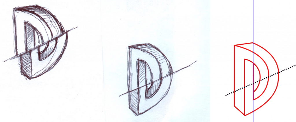
Johanna talked about how we ran a charette on what was outside the frame. She showed some of the designs. Now we have a bunch of design challenges for inside the frame. One principle we are working with is that a visualization can’t be only data driven. There has to be a dialogue between the graphical display and the data. Thus we can have visualization driven data and vice versa.

We broke the tasks down to:

  • Survey visualization types
  • Study pictorial conventions
  • Create graphical activators
  • Propose some epistemological / hermeneutical dimensions
  • Use three dimensionality
  • Apply to cases
  • Consider generalizability

Read more

Materializing the Visual

Materialization of Bubblelines

The Canadian Society for Digital Humanities 2016 conference was held this year in Calgary, Alberta. Milena Radzikowska presented a paper on “Materializing Text Analytical Experiences: Taking Bubblelines Literally” in which she showed a physical system designed to materialize a Bubblelines visualization. (Bubblelines is a tool in the Voyant suite of tools.) In here talk she demonstrated the materialization filling tubes with different coloured sand for the words “open” and “free” as they appeared in a text. She talked about how the materialization changed her sense of time and visualization. Read more about the conference in Geoffrey Rockwell’s conference report.

The Making of: The 3DH Logo and How it Got That Way

3dh-threedees

In mid-March this year, I was contacted by Prof Christoph Meister of Universität Hamburg, with whom I had previously collaborated on the re-branding of the European Association for Digital Humanities (EADH). He wanted a logo for the 3DH project.

In the course of the following two weeks, I engaged in an intensive email exchange with the 3DH team and Profs Johanna Drucker and Geoffrey Rockwell, both of whom are visiting professors in Hamburg this summer term as part of the 3DH project. By the end of the month, we had worked out a logo design that everybody considered a success.

The following timeline is a collage of discussion fragments, logo sketches and drafts that passed back and forth in an ad-hoc collaboration conducted entirely via email; the timeline seeks to document the main ideas that guided the collaboration and to capture a sense of the process by which we arrived at the final design as displayed on this site now.

Read more

Mark Grimshaw: Rethinking Sound

Mark Grimshaw from Aalborg University, Denmark gave the lecture yesterday (May 26th) on  Rethinking Sound. (See video of talk here.)

Grimshaw has been interested in game sound for some time and how sound helps create an immersive experience. He is also interested in how games sonify others in a multi-player game (how you hear others). He is also interested in virtual reality and how sound can be used to give verisimilitude.

Why rethink sound? He started by discussing problems with definitions of sound and trying to redefine sound to understand sonic virtuality. The standard definition is that sound is a sound wave. The problem is that there are really two definitions:

  • sound is an oscillation of pressure or sound wave, or
  • sound is an auditory sensation produced by such waves (both from the ANSI documentation)

He mentioned another definition that I rather liked, that sound is “a mechanical disturbance in the medium.” This is from an acoustics textbook: Howard, D. M., & Angus, J. (1996). Acoustics and psychoacoustics. Oxford: Focal Press.

Not all sounds produce an auditory sensation (like ultrasound) and not all sensations are created by sound waves (eg. tinnitus). For that matter, sound also gets defined as that which happens in the brain. The paradox is:

  • Not all sounds evoke a sound, and
  • Not all sounds are evoked by sound.

Read more

Sustainability of Visualizations

Elaborate visual simulations for cultural heritage studies have a sustainability problem. As Erik Champion told us, they are often broken before the project even ends. For that matter, why do most museum interactive exhibits break before I get a chance to try them? If visualizations are to develop as a form of scholarly communication we need to imagine how to build visualizations that are sustainable.

Sustainability of digital scholarship has been addressed by organizations like Ithaka S+R in their Sustaining Our Digital Future: Institutional Strategies for Digital Content (PDF) and by scholars like Jerome McGann in Sustainability: The Elephant in the Room. The Ithaka report rightly points out all the human and technical infrastructure that supports projects that is overlooked and not considered by projects. Projects usually get funding to be created, but not maintenance funding and there are no strategies to develop units like libraries to sustain projects (as opposed to just preserving the data.) McGann points out how the third leg of scholarship, namely the scholarly publishers, is struggling and we need to imagine what a healthy scholarly publishing industry would look like in the digital age.

How can we imagine infrastructure for visualization that is sustainable, not only over the course of a project, but over the time that you share an insight?

Videos available of the lectures

Did you know that the 3DH lectures are available online? Here are the recent lectures:

What if cats came to your visualization?

IMG_1938
Neko Atsume: Kitty Collecting Game

We have been discussing what we can learn about visualizations from gaming. One broad area is to look at how games use HUDs (Heads-Up Displays). Another is to look at how games use the time of the player. Perhaps the most unintuitive use of time is the postponement typical of various pet simulators and the recently popular and translated Neko Atsume: Kitty Collector game. In pet simulations like the Tamagotchi the chronotope is not the intense, fast, immersive experience of a first-person shooter, but the slow everyday rhythms and spaces of life. You carry the toy with you and feed your pet in real time. For periods you can’t do much unless you speed up the time. The play is in how you sustain play with small interventions over time. Imagine if we had visualizations that postponed gratification?

Read more

Watching Olympia: Visual Programming for Surveillance

visualprogramming
Olympia Visual Programming Slide

I (Geoffrey Rockwell) gave the May 12th lecture on the subject of visual programming languages (VPL). I started by providing a surveillance context for understanding why VPLs are developed to provide a way into programming. The context was the CSEC slide deck leaked by Snowden that shows the Olympia Network Knowledge Engine which allows analysts to access other tools from the 5-Eyes services. Olympia includes a VPL for creating “chains” that automate surveillance processes (see the slide above in which the VPL is introduced.) I argued that in many ways we in the humanities also do surveillance (of cultural history) and we pay attention to tools like Olympia developed to help analysts automate interpretative tasks. I also argued that we need to study these types of slide decks as examples of how big data analysis is conceived. These are the types of tools being developed to spy on us and manage us. They are used by governments and corporations. We need to learn to read the software and documentation of algorithmic management.

The heart of the talk was a survey of VPLs. I argued that we have had specialized formal visual languages for some time for describing wiring diagrams or signalling plans for train stations. These languages allow someone to formally represent a process or design. I then gave a brief history of visual programming and then turned to VPLs in the digital humanities. This connected to a survey of some types of VPLs as I wanted to go beyond the pipe-and-flow types of VPL. I then summarized some of the opportunities and challenges for VPLs in the digital humanities and returned to Olympia. VPLs only work when there is a community that develops and understands the semantics of their visual language. Wiring diagrams work because people understand what a line connecting two icons means and what the icons mean in the context of electronics. For visualization in general and VPLs in particular to work in the humanities we need to develop both a visual literacy and a discussion around the meaning of visual semantics. One way to do that is to learn to read VPLs like Olympia. Again, the humanities need to take seriously these new types of documents as important and worth studying – both PowerPoint decks (that are handed around as a form of communication) and software like VPLs.

Read more

Framing Visualization

Historic specimen from the Natural History Museum in Verona

How are visualizations framed? As part of a design session we brainstormed about the ways visualizations are framed:

  • They are framed by texts like labels, legends, titles, captions, and other explanatory texts.
  • They can have links to other texts, other visualizations, or even help systems.
  • They will have controls that are part of the frame of the visualization itself. These controls are sometimes right in the visualization (direct manipulation) and sometimes in separate visual spaces.
  • They draw from data that you can sometimes see in other panels or get access to. The data can have different levels in that there could a corpus of texts and then a table of results of a statistical process that is then used to generate the visualization.
  • They are created by code which can sometimes be seen. You can see code in a visual programming system or spreadsheets. Some systems will show you the code that is running or give you a space to enter complex queries (which are a higher level of code that acts as a control.) In notebooks the code is visible too.
  • There will be a social frame of people interacting with the visualization and “consuming” it. They are made and used by communities whose diversity of values, positions, cultural conventions and mores are part of the conditions of their production, access, and reception. These community frameworks shape the design process. We tend to think of visualizations as being used by one person on a personal computer, but they also show up in presentations before groups of people, on television as part of a mediated presentation, on public displays and over the internet for others to look at. We need to pay attention therefore to the ways that groups of people share visualizations including the ways they show their screens to each other. Who controls group or public visualizations?

Read more