Over the span of two and a half days we had an intense and productive workshop that had the goal of refining and reifying the three concepts we had developed so far over the course of the last weeks. Springboards for this process were on the one hand our four conceptual 3DH postulates: 2-way-screen, parallax, qualitative and discursive, on the other hand reflections about supporting the process of interpretation in digital tools. We specifically discussed the relevance of the article “Thinking about interpretation: Pliny and scholarship in the humanities” by John Bradley.
What is intriguing in the software “Pliny” described by Bradley, is, that scholars are very not bound in the way they organize their notes and annotations, there is no need to assign distinct categories or relations to them. Instead, these can be organized on a plane and emerging structures becoming apparent can be inscribed by encapsulating them in boxes, when the interpretation progresses.
This appears to be a way of modelling interpretative data that takes into consideration methods scholars have been using in the analog world, however, also exceeds that and opens up new possibilities enabled by the digital (in terms of interaction with and visualization of data), an approach that seems very much related to the goals of the 3DH project as well.
In our design process so far we have based our concepts on real-world scenarios fed by experiences of literature scholars in research projects and arrived at similar conclusions as Bradley: It seems counterintuitive for scholars to force them to apply structure to their annotations when they start with their process. Relations between and qualitative statements about annotations often can only be made when the process has progressed.
When we discussed the wireframes in the workshop we realized that we can differentiate two different environments or spaces of literary scholarly work: Johanna called this research and argument space. While we define typical descriptive acts of the scholarly process like annotating, collecting and commenting as research activities, we consider tasks like grouping, ordering and organizing as interpretative or at later stages argumentative activities. Usually scholars switch between activities of either of the modes perpetually.
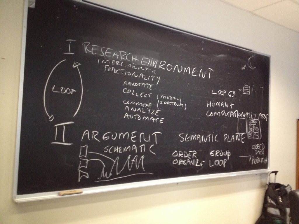 Interplay between research environment and argument environment (by Johanna Drucker)
We understood that this circumstance has to be supported by the interface much more deliberately. Thus, for the next steps in the design process we will focus on the representation of and interaction between these spaces in the interface. What would an interface look like that supports continuous switching between these mentioned activities?
In the discussion we came up with the concept of a semantic plane that might allow us to bring these two spaces together. While we would produce annotations in the research phase that would be represented as glyphs on the plane, in the argument phase we would position and manipulate these glyphs to assign meaning to them and create arguments that we later can publish.
]]>
The poetry scholar Katherine Coles gave a presentation on Poemage at the VIS4DH workshop at VIS2016. Poemage is a tool for exploring and analysing the sound topology of a poem. It is an interdisciplinary work between poetry scholars, computer scientists and linguists. Recommended reading is not only the presented paper Show ambiguity, which takes a more poetry scholar influenced perspective on Poemage but also the companion paper which complements “Show ambiguity” by adding the computer scientist stance to it. Besides the methodological principles that are covered by Poemage both papers give also great insight into the collaborative aspects of the project across disciplines.
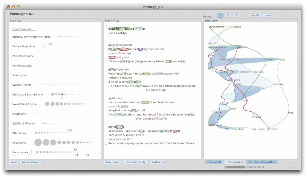
The UI of Poemage offers three views. The Set View offers rhyme sets, which are sets of words that are connected by a specific rhyme scheme. The rhyme sets are organized by rhyme types. Each circle represents a specific rhyme set. The size of the circle depends on the number of words in the set. The Poem View shows the poem in its original form and the Path View gives a 2D space where the flow of the poem according to its rhyme topology is displayed. Each node in the path view represents a word in the poem and is positioned in relation to its position in the layout of the poem. The curves show the flow of a rhyme set through the poem. The views are linked by color coding and by interaction: e. g. selecting a rhyme set in the Set View also activates the visualization of that rhyme set in the other two views.
I like especially the openness of the tool. It supports and encourages multiple readings and the rhyme types are extensible in two ways. The simple way allows the scholar to group words freely to form custom sets without being bound to any predefined rhyme type. The more complex way allows the scholar to access the underlying rules engine or formalism to formulate new rhyme types in a notation which is geared to poetry scholars.
The representation of rhyme sets as paths allows exploration of the rhyme topology by examining spatial phenomena of the paths like intersections, mergings and divisions. There is a tight link between the visualisation and the poem that makes it easy to trace back observations in the visualization to the original data.
Another interesting aspect of her talk was when Coles shared her view on the humanistic idiosyncrasies of data visualization, especially in poetry scholarship. She wanted Poemage “to provide an aesthetically enriched experience” and emphasized the engagement between scholar and object of study which should extend to the visualization as well.
When we discussed the special needs for the humanities for visualization in the 3DH project so far, I (with a computer science background) was very sceptical about seeing the humanities on one side and the hard sciences on the other side. On the contrary I can see a lot of common ground between a physicist and a humanities scholar exploring and interpreting his or her data with visualizations. Instead of seeing the two as opposites we in 3DH started to work with a methodological continuum between the poles of subjectivity/uniqueness/particularity and objectivity/reproducibility/universality. I doubt that the kind of engagement Coles describes is the same engagement between a physicist and his or her data. I think Coles managed to describe at least part of the possible contribution of visualisation to one extreme of that continuum. And this really helps to track down the methodological differences 3DH visualizations need to account for.
]]>
Lauren Klein‘s paper looked at two 19th century pioneers of data visualization to see what we could learn from them. She asked,
What is the story we tell about the origins of modern data visualization?
What alternative histories emerge? What new forms might we imagine, and what new arguments might we make, if we told that story differently?
Lauren looked at Elizabeth Peabody for an alternative history who is often overlooked because her visualizations are seen as opaque. She compared it to Playfair who is generally considered the first in the canonical history of visualization. Lauren asked why visualizations need to be clear? Why not imagine visualizations that are opaque and learn from them? Her project is a digital recreation project of Peabody’s thinking.
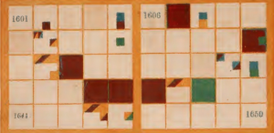
Elizabeth Palmer Peabody (1804-1984) ran a bookstore out of Boston that acted as a salon for the transcendentalists. In 1856 she published a Chronological History of the United States for schools. She traveled around to promote her textbook with a roll of mural charts like domestic rugs (see above). Her charts were based on a Polish process that generated overviews of history.
For modern mavens of visualization like Edward Tufte these charts would not be clear and therefore not effective. By contrast Lauren sees the visualizations of Peabody not as clarifying but as a tool of process or knowedge production. You make knowledge rather than consume it when you make a chart. The clarity to those who didn’t make it is besides the point.
Peabody also sold workbooks for students of school that used the textbook so that they could follow the lessons and rules to generate patterns. Hers is is an argument for making and this making has a historical context. Peabody rejected a single interpretation of history and imagined a visualization system that encourages different interpretations.
This led to one of the points of the talk and that was that the very idea of visualization is itself historically situated and should be examined. And this led to looking again at the canonical works of William Playfair.
She then showed us some of Playfair’s visualizations (from The Commercial and Political Atlas) that are much more readable and for that reason he is often seen as a pioneer in data visualization. Playfair is widely considered one of the first to abstract phenomena to data for visualization. Lauren pointed out how Playfair was not sure how his visualizations would be interpreted, but he did want them to make an impression that was “simple and complete.” He was good at this.
She then showed Lyra: A Visualization Design Environment, an open source alternative to Tableau. There are a lot of Playfair emulators who use things from Lyra to everyday tools like Excel to recreate Playfair’s charts. There are plenty of tools now out there with which one can create visualizations including try to emulate Playfair.
What is interesting is that the designers of the professional tools made decisions about what visualizations should or could do. Thus we see a lot of line and bar charts and little resembling Peabody’s. The widely held belief is that visualization should condense and clarify.
Recreating Peabody
Lauren then shifted to describing an ongoing project to recreate some of Playfair and Peabody’s charts with different tools. They found the existing tools, like D3, hard to use. The tools all assume you start with data. This made her think of the status of data and its relationship to visualization.
She pointed out that when you use a tool for visualization you don’t worry about the shape of the curve, you let the tool do that. Playfair did, however worry about it. He had to engrave the curves by hand and he played with the lines trying to make them attractive to the eye.
Watt, for whom Playfair worked, suggested to him that he put the tables next to the charts. He did this in the first two editions of his book (and then removed the tables for the third.) Even with those charts some of the graphs are hard to recreate. To make one of Playfair charts they had to use data from two different places in Playfair. Again, almost all tools, like D3, now depend on data. The dependence on data is structurally woven in, unlike more artistic tools like Illustrator.
She then showed an engraving error detail and discussed how it could have come about due to Playfair being tired when making the copper plate. In the digital artefact we don’t see such errors – we only see the finished project. The digital masks the labour. Only in Github are changes/labour saved and viewable.
Then she showed the prototypes her team has made including a “build” mode where you can construct a Peabody chart. They are now planning a large scale project using LEDs on fabric to create a physical prototype as that would be closer to the fabric charts Peabody made.
This returned her to labour, especially the labour of women. Peabody made copies of the charts for classes that adopted her book. Alas, none of these survived, but we do have evidence of the drudgery in her letters.
To Lauren the Peabody charts remind her of quilts and she showed examples of quilts from Louisiana that were a form of community knowledge constructing genealogies. Such quilts have only recently been recognized as knowledge comparable to the logocentric knowledge we normally respect.
Lauren closed with a speculative experiment. How would we think differently if Peabody’s charts had been adopted as the standard to be emulated rather than the line charts of Playfair? How might we know differently?
Her team’s recreations of both the Playfair and Peabody charts are just such a sort of speculation – understanding though making.
You can watch the video with slides here.
]]>
Stan Ruecker gave the 3DH talk on the 23rd of June with the enigmatic title The Digital Is Gravy. He explained the title in reference to gravy being the what gives flavour to the steak. In his case, he wanted to show us how physical prototyping can give substance (steak) to the digital.
Stan started with an example of a physical prototype that materializes bubblelines that was developed by Milena Radzikowska who showed it at Congress 2016 in Calgary. (See Materializing the Visual.) He suggested that materialization of a visualization slows down analysis and leads to other lines of thought.
At the IIT Institute for Design Stan is weaving physical prototyping into digital design projects. His main research goal is to find ways to encourage people to have multiple opinions. He want to build information systems that encourage the discovery of different perspectives and the presentation of multiple opinions on a phenomenon. The idea is to encourage reflective interpretation rather than dogmatism.
How prototypes build understanding
He listed some ways that prototyping can build understanding:
- Build something to collect information
- The prototype is itself a kind of evidence
- Learning through making. You don’t even need to finish a prototype. “Fail early and fail often.”
- Prototype is also a representation of the topic area
Why physicality is important
After returning to the materialized bubblelines he talked
- Materialized prototypes take time differently which can lead
- It can produce results that can be used for comparison (with other results)
- It can engage physical intelligence – embodied experience can leverage different ways of knowing
- It involves collaboration (over time) that involves community knowing
- It encourages multiple perspectives from different people and different points of view
My experience with the pleasures of physical prototyping in a group reinforces the way the making of the
Timelines
He then talked about a project around timelines that has built on work Johanna Drucker did. He had gone through multiple prototypes from digital to physical as he tried to find ways to represent different types of time. He tried creating a 3D model in Unity but that didn’t really work for them. He now has a number of student designers who are physically modelling what the timeline could be like if you manipulated it physically and then that was uploaded to the digital representation (the gravy.)
Physical Qualitative Analysis
He then talked about how a multinational team is designing physical analytical tools. The idea is that people can analyze a text and model an understanding of it in a physical 3D space. It is grounded theory – you build up an emergent understanding. They tried creating a floating model like a Calder sculpture. They tried modelling technical support conversations. They used a wired up coat rack – hacking what they had at hand.
My first reaction is that doing this physically would be so slow. But that is the point. Slow down and think by building. They tried a digital table and that was no fun so they started making all sorts of physical
I’m guessing it would be interesting to look at Ann Blair’s Too Much To Know where she talks about the history of note taking and physical ways of organizing information like excerpt cabinets.
Stan then talked about a successful line of prototypes that had transparent panels that could be organized, joined, and on which ideas could be put with post-it notes. Doing this in a team encourages users to different views on a subject as the panels have two sides and can be jointed to have even more.
Finally, they are now trying to bring these back to the digital so that once you have an arrangement of panels with notes you can digitize it and bring it into the computer. This also suggests the possibility of automatically generating the model on the computer from the text.
He commented on how he has no industry industry interested in the analysis of conversations.
And that was the end.
]]>
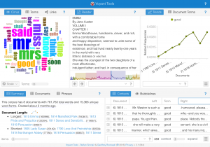
Geoffrey Rockwell ran a Voyant workshop for interested students and faculty on Thursday the 16th of June. The workshop used this script.
]]>Even when you deal with relative frequency you can get what look like wild variations. These often are not indicative of something in the time, but indicate a small sample size. The diachronic datasets often have far fewer books per year in the early centuries than later so the results of searches can vary. One book with the search pattern can appear like a dramatic bump in early years.
There are also problems with claims made about data. There is a “real world” from which we then capture (capta) information. That information is not given but captured. It is then manipulated to produce more and more surrogates. The surrogates are then used to produce visualizations where you pick what you want users to see and how. All of these are acts of interpretation.
What we have are problems with tools and problems of data. We can see this in how women are represented datamining, which is what this talk is about. She organized her talk around the steps that get us from the world to a visualization. Her central example was Matt Jocker’s work in Macroanalysis on gender that seemed to suggest we can use text mining to differentiate between women and men writing.
World 2 Capta
She started with the problem of what data we have of women’s writing. The data is not given by the “real” world. It is gathered and people gathering often have biased accounting systems. Decisions made about what is literature or what is high literature affect the mining downstream.
We need to be able to ask “How is data structured and does it have problems?”
Women are absent in the archive – they are getting erased. Laura thinks these erasures sustain the illusion.
Capta 2 Data or Data Munging
She then talked about the munging of data – how it is cleaned up and enriched. She talked about how Matt Jockers has presented differences in data munging.
The Algorithms
Then she talked about the algorithms, many of which have problems. Moritz Hardt arranged a conference on How Big Data is Unfair. Hardt showed how the algorithms can be biased.
Sara Hajian is another person who has talked about algorithm unfairness. She has shown how it shows prestigious job ads to men. Preferential culture is unfair. Why Big Data Needs Thick Data is a paper that argues that we need both.
Laura insisted that the solution is not to give up on big data, but that we need to keep working on big data to make it fair and not give it up.
Data Manipulation to Visualization
Laura then shifted to problems with how data is manipulated and visualized to make arguments. She mentioned Jan Rybicki’s article Vive la différence that shows how ideas about writing like a man and like a woman don’t work. Even Matt Jockers concludes that gender doesn’t explain much. Coherence, author, genre, decade do a much better job. That said, Matt concluded that gender was a strong signal.
Visualizations then pick up on simplifications.
Lucy Suchman looks at systems thinking. Systems are a problem, but they are important as networks of relations. The articulation of relations in a system is perfomative, not a given. Gender characteristics can be exaggerated – that can be the production of gender. There are various reasons why people choose to perform gender and their sex may not matter.
There is also an act of gender in analyzing the data. “What I do is tame ambiguity.”
Calculative exactitude is not the same as precision. Computers don’t make binary oppositions; people do. (See Ted Underwood, The Real Problem with Distant Reading.) Machine learning algorithms are good at teasing out loose family resemblances, not clear cut differences and one of the problems with gender is that it isn’t binary. Feminists distinguished between sex vs. gender. We now have transgender, cisgender … and exaggerated gender.
Now that we look for writing scales we can look for a lot more than a binary.
Is complexity just one more politically correct thing we want to do? Mandell is working with Piper to see if they can use the texts themselves to generate genders.
It is also true that sometimes we don’t want complexity. Sometimes we want simple forceful graphics.
Special Problems posed by Visualizing Literary Objects
Laura’s last move was to then looked at gender in literary texts and discuss the problem of mining gender in literary texts with characters. To that end she invoked Blakey Vermeule, Why Do We Care About Literary Characters? about Miss Bates and marriage in Austen’s Emma.
Authors make things stand out in various ways using repetition which may through off bag-of-words algorithms. Novels try to portray the stereotypical and then violate it – “The economy of character.
Novels are performing both bias and the analysis of bias – they can create and unmask biases. How is text mining going to track that.
In A Matter of Scale, Jockers talks about checking confirmation bias to which Flanders replies about how we all operate with community consensus.
The lone objective researcher is an old model – how can we analyze in a community that develops consensus using text mining? To do this Laura Mandell believes we need capta open to examination, dissensus driving change, open examination of the algorithms and then how visualizations represent the capta.
]]>Can we augment current visualizations to better serve humanists and, at the same time, make humanistic methods into systematic visualizations that are useful across disciplines outside the humanities?
She commented that there is no lack of visualizations, but most of them have their origins in the sciences. Further, evidence and argument get collapsed in visualization, something we want to tease apart. In doing this, can we create a set of visualization conventions that make humanities methods useful to other disciplines? Some of the things important to the humanities that we want to make evidence include: partial evidence, situated knowledge, and complex and non-singular interpretations.
Project development is part of what we have been focusing on. We have had to ask ourselves “what is the problem?” We had to break the problem down, agree on practices, frame the project, and sketch ideas.
Johanna talked about how we ran a charette on what was outside the frame. She showed some of the designs. Now we have a bunch of design challenges for inside the frame. One principle we are working with is that a visualization can’t be only data driven. There has to be a dialogue between the graphical display and the data. Thus we can have visualization driven data and vice versa.
We broke the tasks down to:
- Survey visualization types
- Study pictorial conventions
- Create graphical activators
- Propose some epistemological / hermeneutical dimensions
- Use three dimensionality
- Apply to cases
- Consider generalizability
Visualization Types
Johanna then went through showed the typology we are working with:
- Facsimiles are visual
- XML markup also has visual features, as do word processing views
- Charts, Graphs, Maps, Timelines
- 3D renderings, Augmented realities, Simulations
- Imaging techniques out of material sciences
Graphical Activators
She talked about graphical primitives and how we need to be systematic about the graphical and interactive features we can play with. What can we do with different primitives? What would blurring mean? What happens when we add animation/movement, interactivity, sound?
With all these graphical features, then the question is how can we combine the activators with interpretative principles.
Using the 3rd Dimension as Interpretation
She then talked about how we can use additional dimensions to add interpretation. She showed some rich examples of how a chart could be sliced and projected. We can distort to produce perspectives. The graphical manipulation lets us engage with the data visually. You can do anamorphic mapping that lets us see the data differently.
She then talked about perspectivization – when you add a perspective to the points. You dimensionalize the data. You add people to the points. Can we use iconography?
She showed ideas for different problems like the hairball problem. She showed ideas for how visualizations that are linked can affect each other. She showed ideas for the too much Twitter problem.
She talked about the problem of how to connect different ideological taxonomies for time like biblical and scientific time without collapsing them? How can we show the points of contact without reducing one to the other?
She then talked about the issue of generalizability. Can we generalize the ideas she has been working with? How can we humanize the presentation of data? Can we deconstruct visualizations?
Some of the questions and discussion after her talk touched on:
- To what extent are visualizations culturally specific?
- Does adding more graphical features not just add more of the same? Does it really challenge the visualization or does it add humanistic authority?
- How is adding more dimensions a critique of display rather than just more display?
- We talked about the time of making the visualization and the time of the unfolding of the visualization.
- We talked about how time can represent something or model something.
- Can we imagine games of making visualizations? How does the making of the visualization constitute a visualization? Can a way of making visualizations be more useful?
- How can any visualization have the APIs to be connected to physical controls and physical materializations?
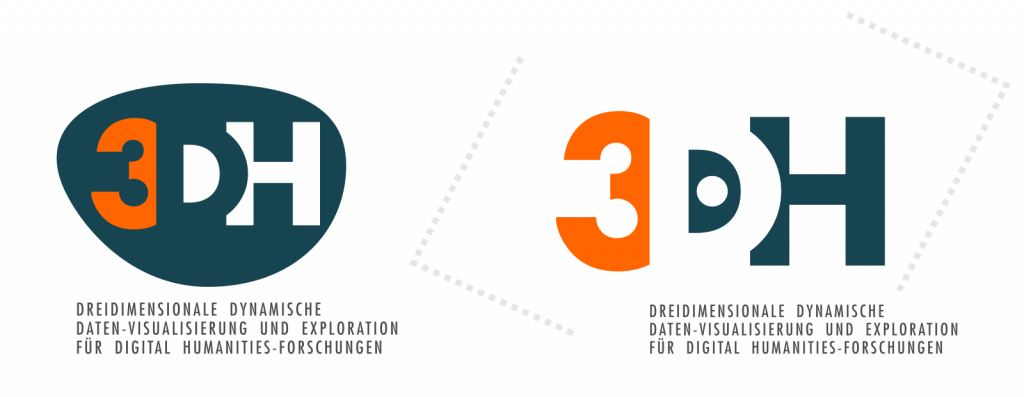
In mid-March this year, I was contacted by Prof Christoph Meister of Universität Hamburg, with whom I had previously collaborated on the re-branding of the European Association for Digital Humanities (EADH). He wanted a logo for the 3DH project.
In the course of the following two weeks, I engaged in an intensive email exchange with the 3DH team and Profs Johanna Drucker and Geoffrey Rockwell, both of whom are visiting professors in Hamburg this summer term as part of the 3DH project. By the end of the month, we had worked out a logo design that everybody considered a success.
The following timeline is a collage of discussion fragments, logo sketches and drafts that passed back and forth in an ad-hoc collaboration conducted entirely via email; the timeline seeks to document the main ideas that guided the collaboration and to capture a sense of the process by which we arrived at the final design as displayed on this site now.
…
In his initial message to me, Christoph emphasised the need for the project to have a visual identity. On 14 March 2016, he wrote:
I’ve just started a new research project for which we need a visual identity – and this time that’s doubly important as the project itself is about visualization.
Moreover, the design needed to reflect the ambitions of the project as articulated in Johanna’s latest book:
[I’m looking for] a suitable logo idea that can serve to highlight what Johanna so aptly emphasizes in “Graphesis”: the importance of thinking about visualizations as a genuine epistemic and explorational device rather than a mere representational instance of ‘data’.
To illustrate what a successful design might look like, he cited a drawing reproduced in the book:
I came across Johanna’s mention of Kandinsky’s “From Point and Line to Plane” on p.35 in “Graphesis” and was immediately attracted by Fig.98 in the right hand margin: For me the vertical line touching the upper border signifies a subtle transgression of the idea of visually supported dualism as it pulls the reference plane within the square and that of the perceiver notionally situated outside the square (if you wish, the discourse plane) together and brings them into contact.
I accepted the job and set to work.
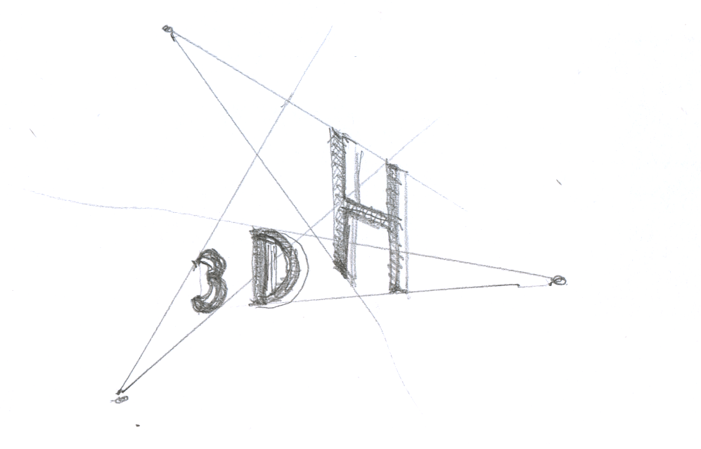
Identity design is in large measure typography, and typography is often a good starting point when creating a new logo. For this project I decided to start from the genre of decorative typefaces known as ‘shaded,’ as these invoke a sense of 3-dimensionality.
I also noticed a possible connection between the design brief and a peculiarity of the 3DH acronym. I knew enough of Johanna and Geoffrey’s work to understand that the phrase ‘epistemic and explorational’ in Christoph’s brief related to their conviction that interfaces and visualisations should be re-conceived to facilitate interpretation as their primary affordance; at the same time the D in the 3DH seemed to invite, if not require, interpretation due to its indeterminacy. I wrote on 16 March 2016 at 12:04 hrs:
As design briefs go, the above requirement is definitely one of the tougher assignments I’ve seen.¶ I wonder if it could be solved through a bit of playfulness. Let’s start with the project name: 3DH. There’s a quibble to be had from this name as to whether the 3D or the DH part should be the privileged reading: the D is ambiguous, therefore in need of interpretation.
I proposed a series of four typographic markers based on this idea, using the colours black and red to delimit the 3D and the DH groupings, with the fourth piece in the series separating the two colours in a diagonal division running through the letter D:

Johanna responded to this design by bringing up the concept of parallax, the displacement in the apparent position of an object viewed along different lines of sight, which she had discussed previously in some of her published work. In this work she asserts that through visualisations implementing the concept, it will be possible for value, identity, and relation of temporal events to be ‘expressed as a set of conditions, rather than givens’. She wrote on 16 March 2016, 13:24 hrs:
I’m wondering if the concept of parallax could be built in here to go “beyond representational concepts of visualization”.¶ Unfortunately, most diagrams of parallax are pretty reductive. But if you could imagine the 3DH logo you’re playing with constructed from two points of view or scales and have them not match but still relate–sort of like extending that diagonal slice through the D in the fourth version of the logo, but so that it refracts the letters. I would suggest lightening the design as well so it is not quite so solid/architectonic.
She illustrated her idea with a number of hand-drawn and scanned sketches, collated into a single PDF.
A diagram consisting of conceptual space mapped out by thin lines and inhabited by typographic elements at comparatively small size is in danger of looking ethereal and anaemic at small scales, especially when displayed next to more conventional logotypes.
On 21 March 2016 at 15:19 hrs, Johanna conceded that her diagrammatic approach would be susceptible to the scaling issue, yet she suggested that there might be a way to merge our separate approaches into in a single design:
I wonder if we can work with that ambiguity and an indication of non-identity or non-similarity between the two meanings of the “D” in the acronym. That could introduce the parallax issue in some way.
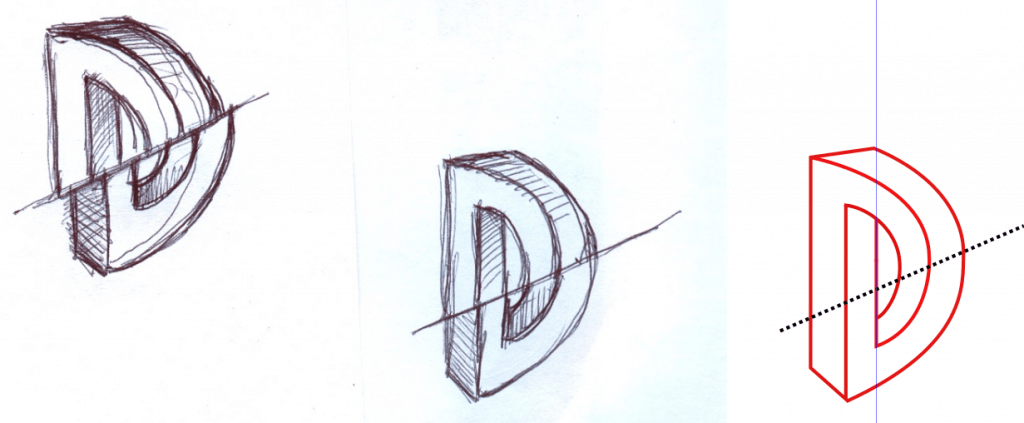
I frankly didn’t know how to act on this suggestion, so I tried a variation on the D that faces two ways. I understood that both Johanna and Geoffrey were opposed to anything ‘Cartesian’, so central perspective was out of the question. My suggestion made use of a roughly cobbled-together axonometric projection, about which I wrote, on 22 March 2016 at 11:48 hrs:
Attached as well is another take on the same idea expressed in a 3×5 pixel font rendered 3D in axonometric projection (channelling my inner Max Bill here). The piece turns on the ‘ambiguity’ of the D again, as the letter associates with the 3 in its orientation but associates with the H in its colour.
Christoph was intrigued by the piece, and he wrote on 22 March 2016 at 12:53 hrs:
it creates a weird Escher-like paradoxical n-dimensionality that loops onto itself and makes it, how shall I put it, “performative” in that you simply cannot stop re-processing the image.
He encouraged me to pursue the idea further, but Johanna, as I had anticipated from her critique of my initial offering as too ‘solid/architectonic’, was unconvinced. She urged a change of approach on 22 March 2016 at 13:07 hrs:
We might consider using the positive/negative space instead of closing the forms
Playing on positive/negative space, unlike the parallax idea, was something I knew how to handle. I wasn’t very keen on the idea because it seemed to offer less scope for the play on the letter D, but I pursued the idea anyway, resulting in a few iterations that struck me as nicely done but showing little relevance to the design brief.
Meanwhile, Johanna had been at work trying to bring about the merger of our separate starting ideas that she had hinted at. She wrote on 23 March 2016:
I’m going back to your sliced “D” idea and seeing if I can play with some parallax in it.
She supplied a sketch with two drawings:
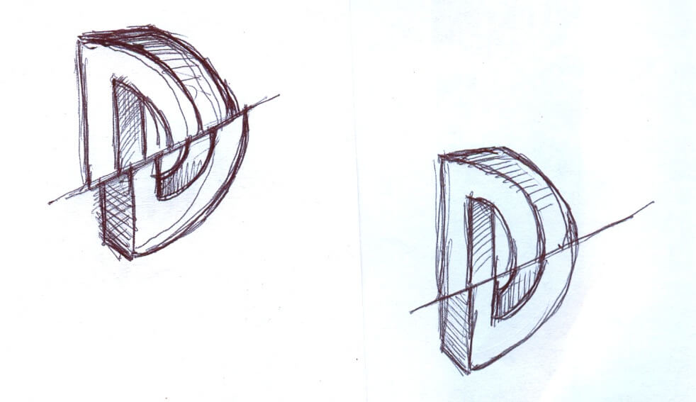
Johanna’s drawings were a welcome occasion to drop the ‘negative space’ idea. They reminded me that a few days earlier my preoccupation with ‘shaded’ typefaces had led me to look at fonts constructed as impossible objects, a typographic genre often associated with the name of the Dutch artist M.C. Escher, who may have done most to popularise such objects. I wrote on 24 March 2016 at 22:29 hrs:
I returned to a few recent Escher-inspired retail typefaces and examined them under the aspect of whether the two yoked-together perspectival components of the D might be coloured different to convey the ‘ambiguity’ of the letter. I put this through a few iterations until it occurred to me that I could vectorise Johanna’s D sketch and use it in the same fashion.¶ Which I did as a rough and ready first cut.¶ Please find the whole series also included in the zip. Don’t worry about the grey/white/yellow colour scheme just yet.¶ I think we have a candidate here.
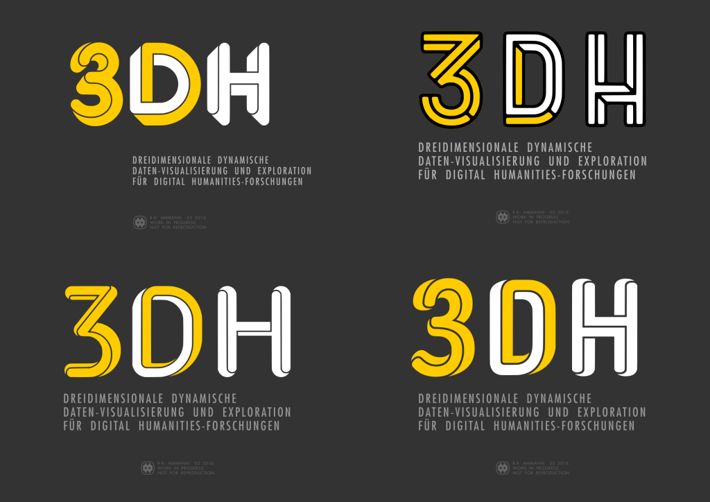
The attachment included two pieces that would form the basis of the eventual design.
This batch of pieces was well received. Johanna wrote on 24 March 2016 at 22:45 hrs:
Oooohhhhh! I am really loving these. I have my favorites, but will hold off until others weigh in. SUPER!!! We are really getting close, I think. Elegant, too!!
Christoph wrote on 25 March 2016 at 06:04 hrs:
Wow, Rudolf,¶ this is really a leap forward!
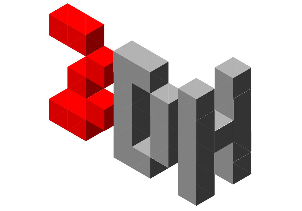
Things took a curious turn at this juncture: Johanna never came back to name her favourites among the Escher batch, whereas Christoph and I focused on the version of the design using Jeremia Adatte’s Bron Black typeface. Oddly, we both shared the concern that the 3 character looked like Homer Simpson‘s face, and that it required a modification to its shape. I also developed an obsession with searching for ‘impossible object’ typefaces and, telling myself I was doing my due diligence, went through as many such typefaces as I could find. And it occurred to me that we could bake the yin and yang motif into the design by not just making the D the location where the two colours cross over from one to the other; in addition, both of the other characters could have their respective main colour counterpointed by a small included segment of the opposite colour.
The work now seemed nearly completed. Christoph wrote on 26 March 2016 at 1:36 hrs:
I think we’re about to reach design freeze!
Johanna agreed, writing on 26 March 2016 at 15:38:
This has been REALLY fun! And so fast!
However, still unresolved was the question of what the colours would be. One possibility, perhaps the obvious one, was to rely on shading, which is conventionally used to evoke the physicality of a three-dimensional object in two dimensions; we could render the design in a local colour and a corresponding shaded hue.
Christoph had another idea. He wrote on 29 March 2016 at 12:48 hrs:
I have to consider internal politics and strategy: I would appreciate if we could either use Hamburg University’s color scheme (see https://www.uni-hamburg.de/) or one that resembles that of the City of Hamburg (which includes blue: see http://www.hamburg.de/). These are my funders who I need to get on board as co-owners and I want to make sure that they, too, will be able to identify with our project.
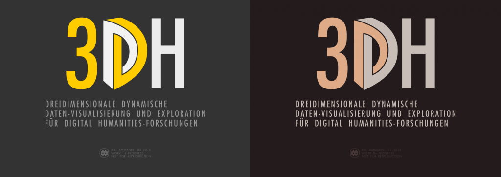
I objected to the adoption of Hamburg’s colour scheme, but Christoph insisted and asked for a draft of the logo, so he could attach it to a mailing to the project funders at the end of the week. In response to this request I started to look for ways to colour the design red and blue.
We seemed to have arrived at the end of the process now. Yet by that point I also nurtured a growing sense of dissatisfaction. It vexed me that we were merely going to apply a minor tweak to a typeface and to play a game with colours that seemed too clever by half while failing to state the design’s basic idea with any clarity or forcefulness.
Why weren’t we using Johanna’s D drawing, which was our own original creation? If anything, I wanted that drawing back! With due apologies for the very late about-face, I lamented on 30 Mar 2016 at 16:27 hrs:
instead of building further on the piece with Johanna’s unique drawing, uniquely connected to the project, we went for a generic, commercially available revival of a nineteen-seventies typeface
I attached a few revisions of the earlier piece.

To accommodate Christoph’s wish for Hamburg styling, I adopted the colour scheme specified in the branding guidelines of the City of Hamburg [PDF] and modified the typography. Throughout this project, I had been using the Futura typeface as a nod to the Bauhaus aesthetic, following Christoph’s mention of Kandinsky during the earliest stage of the collaboration. As Universität Hamburg’s branding guidelines specify TheSans of Lucas de Groot’s wonderful Thesis family of typefaces, I happily switched from the geometric sans serif to the humanistic sans serif.

I was apprehensive of the response to my about-face, as the proposal second-guessed what very much seemed like a done deal. However, both Johanna and Christoph supported the change right away. Johanna wrote on 31 March 2016 at 00:56 hrs:
I really love these […] the larger D in the center with the real dimensionality to it is terrific.
Christoph concurred and wrote on 31 March 2016 at at 06:54 hrs:
Escher-Drucker it shall be. It’s leaner, less self-absorbed and elegantly accentuates the dynamic D as a perceptual and intellectual axis.
This version was adopted, then, and made it into the mailing.
With the site coming online in early April, I implemented the logo and the Hamburg colours in a lightly modified version of the content management system’s GeneratePress presentation layer.
And this is how it all got that way.
]]>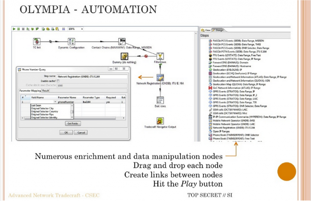
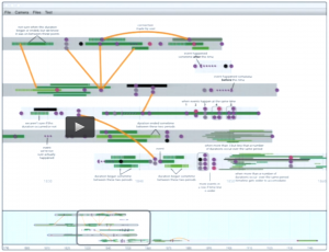
I (Geoffrey Rockwell) gave the May 12th lecture on the subject of visual programming languages (VPL). I started by providing a surveillance context for understanding why VPLs are developed to provide a way into programming. The context was the CSEC slide deck leaked by Snowden that shows the Olympia Network Knowledge Engine which allows analysts to access other tools from the 5-Eyes services. Olympia includes a VPL for creating “chains” that automate surveillance processes (see the slide above in which the VPL is introduced.) I argued that in many ways we in the humanities also do surveillance (of cultural history) and we pay attention to tools like Olympia developed to help analysts automate interpretative tasks. I also argued that we need to study these types of slide decks as examples of how big data analysis is conceived. These are the types of tools being developed to spy on us and manage us. They are used by governments and corporations. We need to learn to read the software and documentation of algorithmic management.
The heart of the talk was a survey of VPLs. I argued that we have had specialized formal visual languages for some time for describing wiring diagrams or signalling plans for train stations. These languages allow someone to formally represent a process or design. I then gave a brief history of visual programming and then turned to VPLs in the digital humanities. This connected to a survey of some types of VPLs as I wanted to go beyond the pipe-and-flow types of VPL. I then summarized some of the opportunities and challenges for VPLs in the digital humanities and returned to Olympia. VPLs only work when there is a community that develops and understands the semantics of their visual language. Wiring diagrams work because people understand what a line connecting two icons means and what the icons mean in the context of electronics. For visualization in general and VPLs in particular to work in the humanities we need to develop both a visual literacy and a discussion around the meaning of visual semantics. One way to do that is to learn to read VPLs like Olympia. Again, the humanities need to take seriously these new types of documents as important and worth studying – both PowerPoint decks (that are handed around as a form of communication) and software like VPLs.
Visual Programming in the Digital Humanities
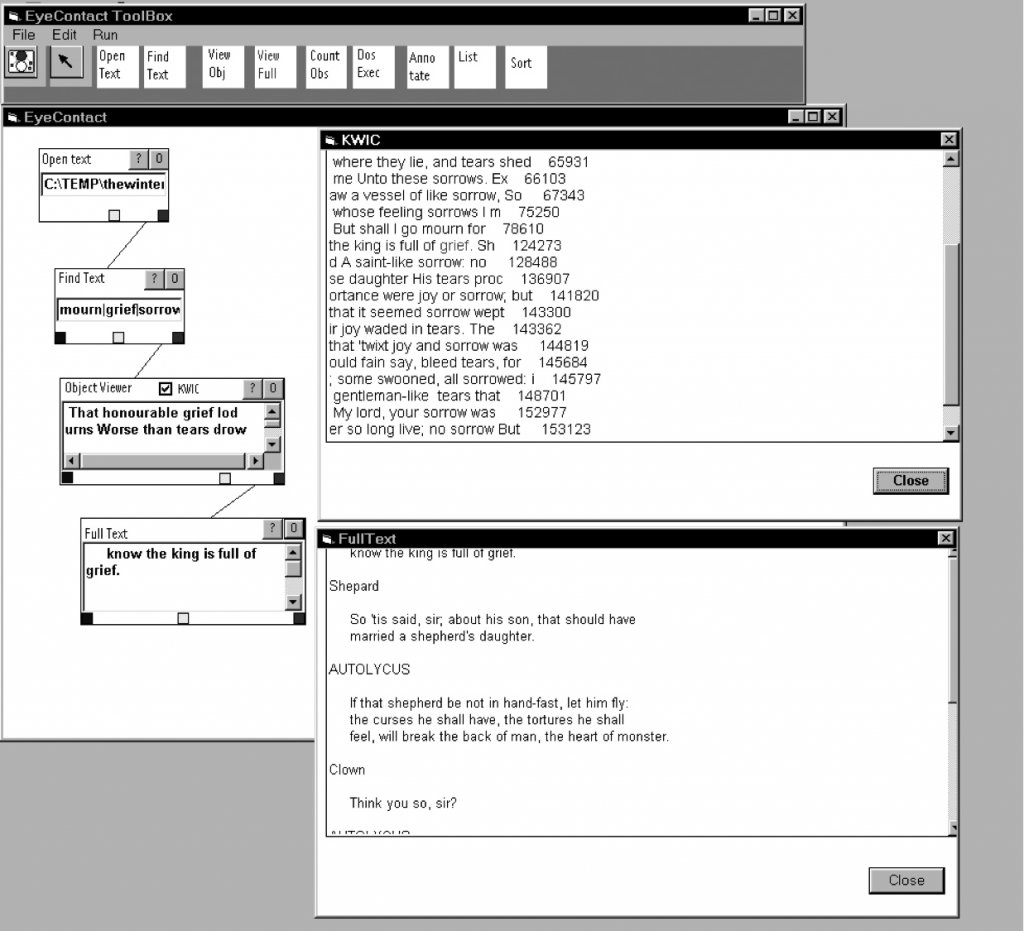
One of the first projects in the digital humanities to prototype a VPL for text analysis was the EyeConTact project by Geoffrey Rockwell and John Bradley. See also a paper Seeing the Text Through the Trees: Visualization and Interactivity in Textual Applications from LLC in 1999. This was inspired by scientific visualization tools like Explorer. Before that there were many projects that shared flowcharts of their programs. For example we have flowcharts of both how computers fit in scholarly concording and how the concording tools worked for PRORA. One can see how generations of programmers raised on flowcharting their programs would desire a flowcharting tool that actually was the programming.
The SEASR project developed a much more sophisticated VPL called Meandre. See Ian Milligan’s discussion of using Meandre. Meandre was designed to allow humanists a way of using all the power of SEASR. Alas, it doesn’t seem to be still maintained.
The best system currently available is built on an open VPL called Orange. Aris Xanthos has developed text analysis modules for Orange called Textable. Xanthos has a paper on TEXTABLE: programmation visuelle pour l’analyse de données textuelles (French). Orange is a well supported VPL that can be extended.
Opportunities and Challenges
Some of the points about the suitability of VPLs to the digital humanities that I made at the end include:
- VPLs are intuitively attractive
- Visual vocabulary is not always clear. What does a pipe mean? What direction do pipes go? Left to right? What flows through a pipe?
- Domain specific applications work best.
- We need to develop a community of use
- VPLs are good at the visualization of process (and data and results in that context). They show rather than hide the processes in a way that can be explored and fiddled with. They are good for showing the chain of filters and transformations that data goes through.
- VPLs are slower than traditional coding for proficient programmers.
- They can be fiddly.
- It is hard to handle a big codebase with a VPL as you end up hiding chains.
- The are good a showing chains of processes, but not at showing highly interactive systems.
Conclusions
Above all, as mentioned above, we need to learn to read visualizations (including VPLs) in the humanities. These are forms of communication that are increasingly important in the algorithmic state. They are used widely in business and government. They are essential to understanding how big data is consumed and used. I propose that developing a discourse and hermeneutics of visualization is fundamental to developing better visualization tools. The two go hand in hand.
]]>
How are visualizations framed? As part of a design session we brainstormed about the ways visualizations are framed:
- They are framed by texts like labels, legends, titles, captions, and other explanatory texts.
- They can have links to other texts, other visualizations, or even help systems.
- They will have controls that are part of the frame of the visualization itself. These controls are sometimes right in the visualization (direct manipulation) and sometimes in separate visual spaces.
- They draw from data that you can sometimes see in other panels or get access to. The data can have different levels in that there could a corpus of texts and then a table of results of a statistical process that is then used to generate the visualization.
- They are created by code which can sometimes be seen. You can see code in a visual programming system or spreadsheets. Some systems will show you the code that is running or give you a space to enter complex queries (which are a higher level of code that acts as a control.) In notebooks the code is visible too.
- There will be a social frame of people interacting with the visualization and “consuming” it. They are made and used by communities whose diversity of values, positions, cultural conventions and mores are part of the conditions of their production, access, and reception. These community frameworks shape the design process. We tend to think of visualizations as being used by one person on a personal computer, but they also show up in presentations before groups of people, on television as part of a mediated presentation, on public displays and over the internet for others to look at. We need to pay attention therefore to the ways that groups of people share visualizations including the ways they show their screens to each other. Who controls group or public visualizations?
Here are some more frames to consider.
- They will have an associated interface like that of a web browser or software.
- There can be computing interface surrounding the visualization on the screen. This might show other applications or controls for the operating system/computer.
- The screen will be a projection surface which has features. A computer screen on a laptop will have a keyboard and webcam attached. A projection on a wall will have other things on the wall. A projection on a building or specially designed surface (like a globe) will be framed by the building or the exhibit design. There may be special controls to an exhibit that are really part of the computing interface. People may be able to use their own devices to send input to a public projection.
- The surface will be part of the infrastructure that makes the visualization possible. That will include the systems, the networking, the electricity, the building and those that maintain them.
- There is a physical site with all sorts of political and cultural issues associated.
- There is a frame of development that creates the visualization, associated data and code. This isn’t necessarily one thing as the data could be created by one group and uploaded to the visualization developed by a different team. The infrastructure could have been developed by yet another group. Development has costs and there are stakeholders like sponsors, granting councils, and universities that provide development support.
- There is an epistemological frame of the tacit and explicit knowledge that is needed to develop and understand the visualization. This can include the new knowledge generated by the visualization and published in different ways. We could have also called this the rhetorical frame in the sense that a visualization is created and used to convey something. It is created and read for pleasure, for information, or to make a point. In this sense there is a performance to the knowing created and explored.
We are obviously pushing the envelope on what is a frame, but the idea was to get a sense of all the things outside the visualization itself that contribute to it. Almost all of these have to be taken into account in an ambitious project like 3DH.
]]>