In mid-March this year, I was contacted by Prof Christoph Meister of Universität Hamburg, with whom I had previously collaborated on the re-branding of the European Association for Digital Humanities (EADH). He wanted a logo for the 3DH project.
In the course of the following two weeks, I engaged in an intensive email exchange with the 3DH team and Profs Johanna Drucker and Geoffrey Rockwell, both of whom are visiting professors in Hamburg this summer term as part of the 3DH project. By the end of the month, we had worked out a logo design that everybody considered a success.
The following timeline is a collage of discussion fragments, logo sketches and drafts that passed back and forth in an ad-hoc collaboration conducted entirely via email; the timeline seeks to document the main ideas that guided the collaboration and to capture a sense of the process by which we arrived at the final design as displayed on this site now.
…
In his initial message to me, Christoph emphasised the need for the project to have a visual identity. On 14 March 2016, he wrote:
I’ve just started a new research project for which we need a visual identity – and this time that’s doubly important as the project itself is about visualization.
Moreover, the design needed to reflect the ambitions of the project as articulated in Johanna’s latest book:
[I’m looking for] a suitable logo idea that can serve to highlight what Johanna so aptly emphasizes in “Graphesis”: the importance of thinking about visualizations as a genuine epistemic and explorational device rather than a mere representational instance of ‘data’.
To illustrate what a successful design might look like, he cited a drawing reproduced in the book:
I came across Johanna’s mention of Kandinsky’s “From Point and Line to Plane” on p.35 in “Graphesis” and was immediately attracted by Fig.98 in the right hand margin: For me the vertical line touching the upper border signifies a subtle transgression of the idea of visually supported dualism as it pulls the reference plane within the square and that of the perceiver notionally situated outside the square (if you wish, the discourse plane) together and brings them into contact.
I accepted the job and set to work.
Identity design is in large measure typography, and typography is often a good starting point when creating a new logo. For this project I decided to start from the genre of decorative typefaces known as ‘shaded,’ as these invoke a sense of 3-dimensionality.
I also noticed a possible connection between the design brief and a peculiarity of the 3DH acronym. I knew enough of Johanna and Geoffrey’s work to understand that the phrase ‘epistemic and explorational’ in Christoph’s brief related to their conviction that interfaces and visualisations should be re-conceived to facilitate interpretation as their primary affordance; at the same time the D in the 3DH seemed to invite, if not require, interpretation due to its indeterminacy. I wrote on 16 March 2016 at 12:04 hrs:
As design briefs go, the above requirement is definitely one of the tougher assignments I’ve seen.¶ I wonder if it could be solved through a bit of playfulness. Let’s start with the project name: 3DH. There’s a quibble to be had from this name as to whether the 3D or the DH part should be the privileged reading: the D is ambiguous, therefore in need of interpretation.
I proposed a series of four typographic markers based on this idea, using the colours black and red to delimit the 3D and the DH groupings, with the fourth piece in the series separating the two colours in a diagonal division running through the letter D:
Johanna responded to this design by bringing up the concept of parallax, the displacement in the apparent position of an object viewed along different lines of sight, which she had discussed previously in some of her published work. In this work she asserts that through visualisations implementing the concept, it will be possible for value, identity, and relation of temporal events to be ‘expressed as a set of conditions, rather than givens’. She wrote on 16 March 2016, 13:24 hrs:
I’m wondering if the concept of parallax could be built in here to go “beyond representational concepts of visualization”.¶ Unfortunately, most diagrams of parallax are pretty reductive. But if you could imagine the 3DH logo you’re playing with constructed from two points of view or scales and have them not match but still relate–sort of like extending that diagonal slice through the D in the fourth version of the logo, but so that it refracts the letters. I would suggest lightening the design as well so it is not quite so solid/architectonic.
She illustrated her idea with a number of hand-drawn and scanned sketches, collated into a single PDF.
A diagram consisting of conceptual space mapped out by thin lines and inhabited by typographic elements at comparatively small size is in danger of looking ethereal and anaemic at small scales, especially when displayed next to more conventional logotypes.
On 21 March 2016 at 15:19 hrs, Johanna conceded that her diagrammatic approach would be susceptible to the scaling issue, yet she suggested that there might be a way to merge our separate approaches into in a single design:
I wonder if we can work with that ambiguity and an indication of non-identity or non-similarity between the two meanings of the “D” in the acronym. That could introduce the parallax issue in some way.
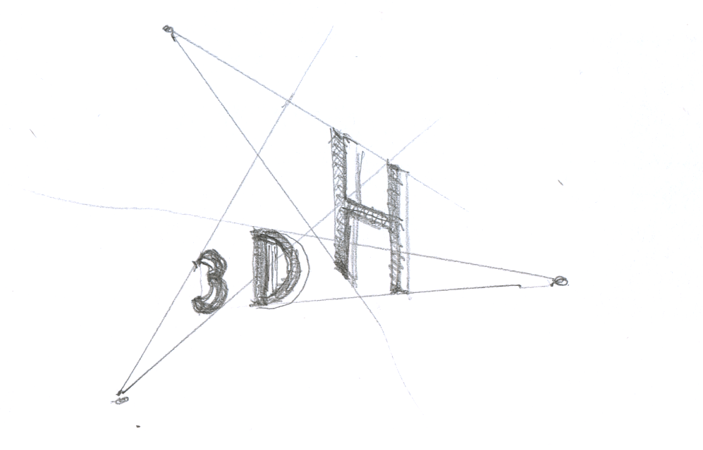
I frankly didn’t know how to act on this suggestion, so I tried a variation on the D that faces two ways. I understood that both Johanna and Geoffrey were opposed to anything ‘Cartesian’, so central perspective was out of the question. My suggestion made use of a roughly cobbled-together axonometric projection, about which I wrote, on 22 March 2016 at 11:48 hrs:
Attached as well is another take on the same idea expressed in a 3×5 pixel font rendered 3D in axonometric projection (channelling my inner Max Bill here). The piece turns on the ‘ambiguity’ of the D again, as the letter associates with the 3 in its orientation but associates with the H in its colour.
Christoph was intrigued by the piece, and he wrote on 22 March 2016 at 12:53 hrs:
it creates a weird Escher-like paradoxical n-dimensionality that loops onto itself and makes it, how shall I put it, “performative” in that you simply cannot stop re-processing the image.
He encouraged me to pursue the idea further, but Johanna, as I had anticipated from her critique of my initial offering as too ‘solid/architectonic’, was unconvinced. She urged a change of approach on 22 March 2016 at 13:07 hrs:
We might consider using the positive/negative space instead of closing the forms
Playing on positive/negative space, unlike the parallax idea, was something I knew how to handle. I wasn’t very keen on the idea because it seemed to offer less scope for the play on the letter D, but I pursued the idea anyway, resulting in a few iterations that struck me as nicely done but showing little relevance to the design brief.
Meanwhile, Johanna had been at work trying to bring about the merger of our separate starting ideas that she had hinted at. She wrote on 23 March 2016:
I’m going back to your sliced “D” idea and seeing if I can play with some parallax in it.
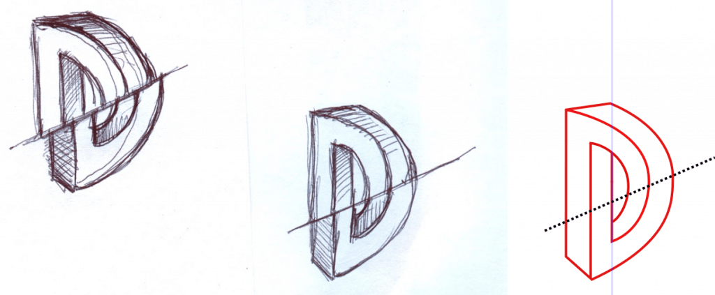
She supplied a sketch with two drawings:
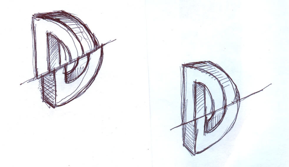
Johanna’s drawings were a welcome occasion to drop the ‘negative space’ idea. They reminded me that a few days earlier my preoccupation with ‘shaded’ typefaces had led me to look at fonts constructed as impossible objects, a typographic genre often associated with the name of the Dutch artist M.C. Escher, who may have done most to popularise such objects. I wrote on 24 March 2016 at 22:29 hrs:
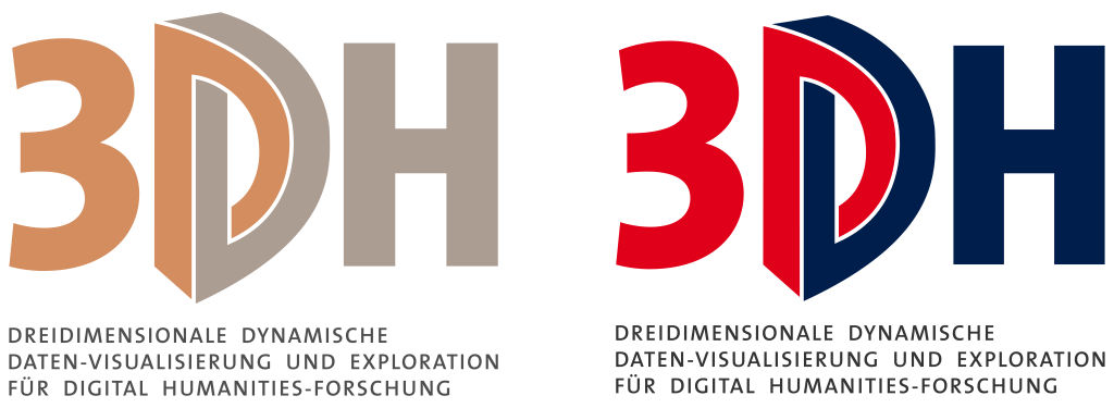
I returned to a few recent Escher-inspired retail typefaces and examined them under the aspect of whether the two yoked-together perspectival components of the D might be coloured different to convey the ‘ambiguity’ of the letter. I put this through a few iterations until it occurred to me that I could vectorise Johanna’s D sketch and use it in the same fashion.¶ Which I did as a rough and ready first cut.¶ Please find the whole series also included in the zip. Don’t worry about the grey/white/yellow colour scheme just yet.¶ I think we have a candidate here.
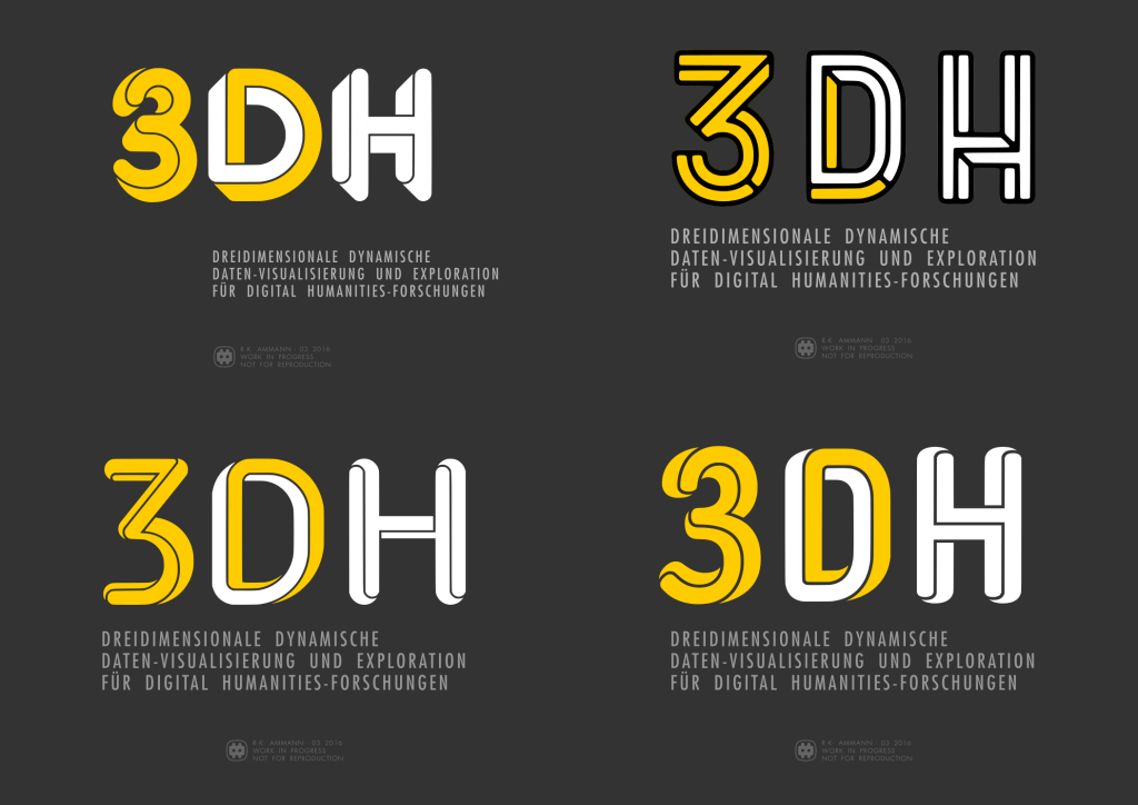
The attachment included two pieces that would form the basis of the eventual design.
This batch of pieces was well received. Johanna wrote on 24 March 2016 at 22:45 hrs:
Oooohhhhh! I am really loving these. I have my favorites, but will hold off until others weigh in. SUPER!!! We are really getting close, I think. Elegant, too!!
Christoph wrote on 25 March 2016 at 06:04 hrs:
Wow, Rudolf,¶ this is really a leap forward!
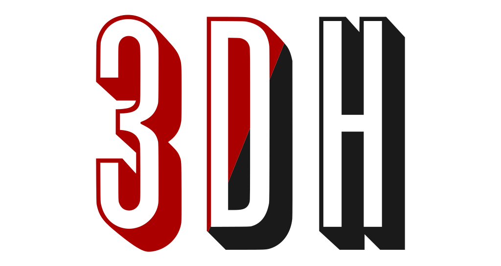
Things took a curious turn at this juncture: Johanna never came back to name her favourites among the Escher batch, whereas Christoph and I focused on the version of the design using Jeremia Adatte’s Bron Black typeface. Oddly, we both shared the concern that the 3 character looked like Homer Simpson‘s face, and that it required a modification to its shape. I also developed an obsession with searching for ‘impossible object’ typefaces and, telling myself I was doing my due diligence, went through as many such typefaces as I could find. And it occurred to me that we could bake the yin and yang motif into the design by not just making the D the location where the two colours cross over from one to the other; in addition, both of the other characters could have their respective main colour counterpointed by a small included segment of the opposite colour.
The work now seemed nearly completed. Christoph wrote on 26 March 2016 at 1:36 hrs:
I think we’re about to reach design freeze!
Johanna agreed, writing on 26 March 2016 at 15:38:
This has been REALLY fun! And so fast!
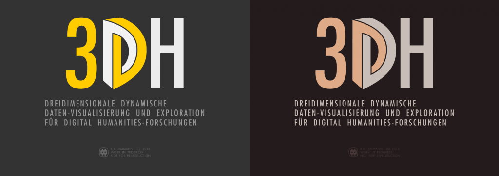
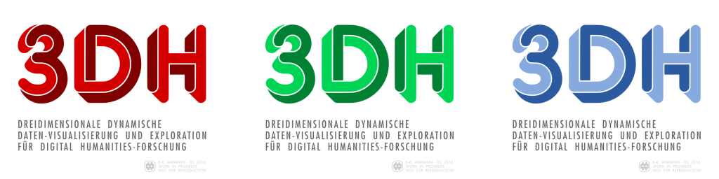
However, still unresolved was the question of what the colours would be. One possibility, perhaps the obvious one, was to rely on shading, which is conventionally used to evoke the physicality of a three-dimensional object in two dimensions; we could render the design in a local colour and a corresponding shaded hue.
Christoph had another idea. He wrote on 29 March 2016 at 12:48 hrs:
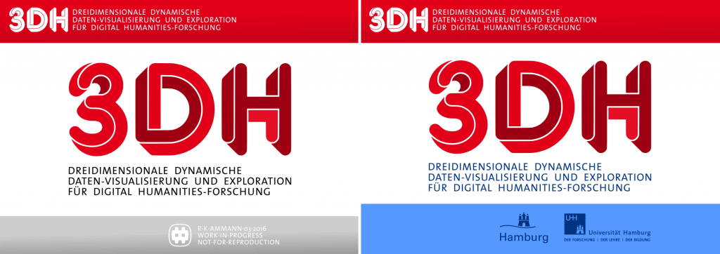
I have to consider internal politics and strategy: I would appreciate if we could either use Hamburg University’s color scheme (see https://www.uni-hamburg.de/) or one that resembles that of the City of Hamburg (which includes blue: see http://www.hamburg.de/). These are my funders who I need to get on board as co-owners and I want to make sure that they, too, will be able to identify with our project.
I objected to the adoption of Hamburg’s colour scheme, but Christoph insisted and asked for a draft of the logo, so he could attach it to a mailing to the project funders at the end of the week. In response to this request I started to look for ways to colour the design red and blue.
We seemed to have arrived at the end of the process now. Yet by that point I also nurtured a growing sense of dissatisfaction. It vexed me that we were merely going to apply a minor tweak to a typeface and to play a game with colours that seemed too clever by half while failing to state the design’s basic idea with any clarity or forcefulness.
Why weren’t we using Johanna’s D drawing, which was our own original creation? If anything, I wanted that drawing back! With due apologies for the very late about-face, I lamented on 30 Mar 2016 at 16:27 hrs:
instead of building further on the piece with Johanna’s unique drawing, uniquely connected to the project, we went for a generic, commercially available revival of a nineteen-seventies typeface
I attached a few revisions of the earlier piece.
To accommodate Christoph’s wish for Hamburg styling, I adopted the colour scheme specified in the branding guidelines of the City of Hamburg [PDF] and modified the typography. Throughout this project, I had been using the Futura typeface as a nod to the Bauhaus aesthetic, following Christoph’s mention of Kandinsky during the earliest stage of the collaboration. As Universität Hamburg’s branding guidelines specify TheSans of Lucas de Groot’s wonderful Thesis family of typefaces, I happily switched from the geometric sans serif to the humanistic sans serif.
I was apprehensive of the response to my about-face, as the proposal second-guessed what very much seemed like a done deal. However, both Johanna and Christoph supported the change right away. Johanna wrote on 31 March 2016 at 00:56 hrs:
I really love these […] the larger D in the center with the real dimensionality to it is terrific.
Christoph concurred and wrote on 31 March 2016 at at 06:54 hrs:
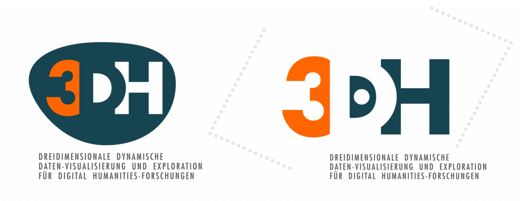
Escher-Drucker it shall be. It’s leaner, less self-absorbed and elegantly accentuates the dynamic D as a perceptual and intellectual axis.
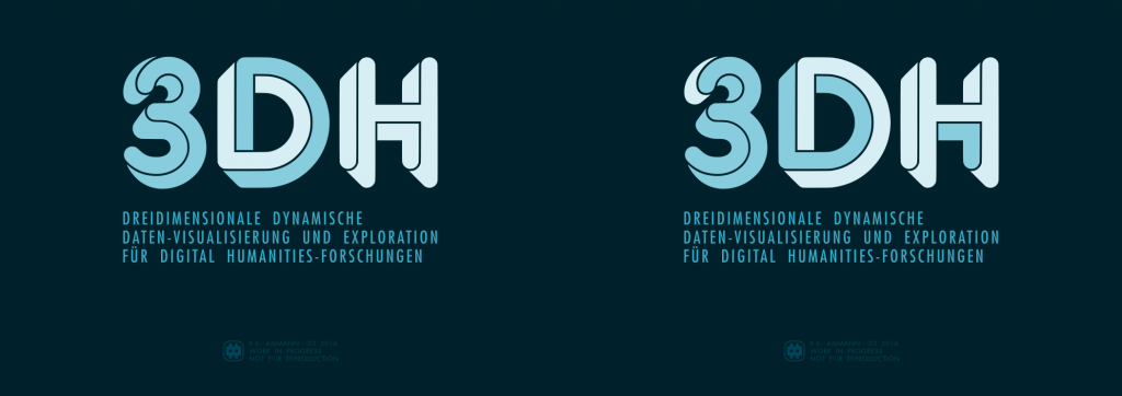
This version was adopted, then, and made it into the mailing.
With the site coming online in early April, I implemented the logo and the Hamburg colours in a lightly modified version of the content management system’s GeneratePress presentation layer.
And this is how it all got that way.