3DH Workshop in Montréal

Prior to this year’s DH conference in Montreal, Canada (8 – 11 August) some of us flew in a little earlier to come together for a workshop in the context of the 3DH project. Apart from the core project team and our colleagues Evelyn Gius and Marco Petris we were joined by our associated members Johanna Drucker, Geoffrey Rockwell and Marian Dörk as well as Laura Mandell.

Over the span of two and a half days we had an intense and productive workshop that had the goal of refining and reifying the three concepts we had developed so far over the course of the last weeks. Springboards for this process were on the one hand our four conceptual 3DH postulates: 2-way-screen, parallax, qualitative and discursive, on the other hand reflections about supporting the process of interpretation in digital tools. We specifically discussed the relevance of the article “Thinking about interpretation: Pliny and scholarship in the humanities” by John Bradley.

What is intriguing in the software “Pliny” described by Bradley, is, that scholars are very not bound in the way they organize their notes and annotations, there is no need to assign distinct categories or relations to them. Instead, these can be organized on a plane and emerging structures becoming apparent can be inscribed by encapsulating them in boxes, when the interpretation progresses.

This appears to be a way of modelling interpretative data that takes into consideration methods scholars have been using in the analog world, however, also exceeds that and opens up new possibilities enabled by the digital (in terms of interaction with and visualization of data), an approach that seems very much related to the goals of the 3DH project as well.

In our design process so far we have based our concepts on real-world scenarios fed by experiences of literature scholars in research projects and arrived at similar conclusions as Bradley: It seems counterintuitive for scholars to force them to apply structure to their annotations when they start with their process. Relations between and qualitative statements about annotations often can only be made when the process has progressed.

When we discussed the wireframes in the workshop we realized that we can differentiate two different environments or spaces of literary scholarly work: Johanna called this research and argument space. While we define typical descriptive acts of the scholarly process like annotating, collecting and commenting as research activities, we consider tasks like grouping, ordering and organizing as interpretative or at later stages  argumentative activities. Usually scholars switch between activities of either of the modes perpetually.

img_2222
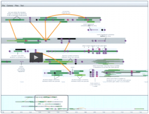
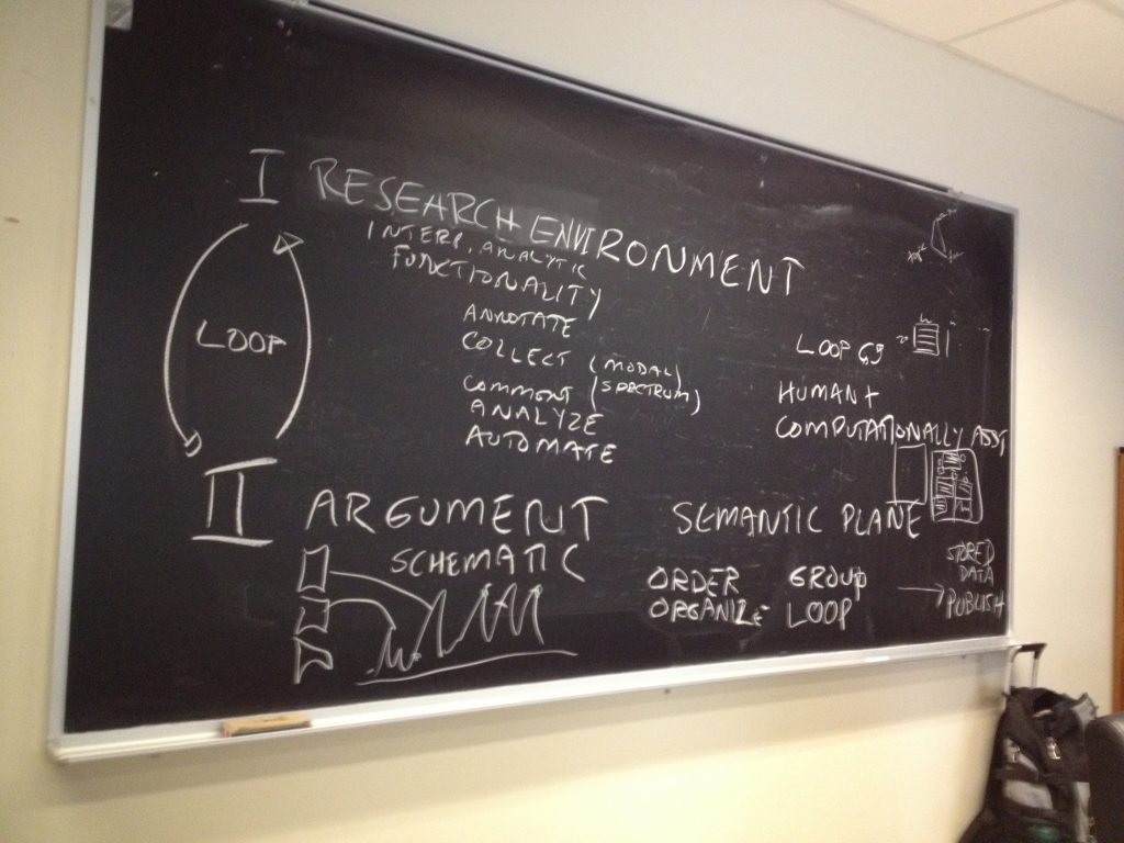
Interplay between research environment and argument environment (by Johanna Drucker)

We understood that this circumstance has to be supported by the interface much more deliberately. Thus, for the next steps in the design process we will focus on the representation of and interaction between these spaces in the interface. What would an interface look like that supports continuous switching between these mentioned activities?

In the discussion we came up with the concept of a semantic plane that might allow us to bring these two spaces together. While we would produce annotations in the research phase that would be represented as glyphs on the plane, in the argument phase we would position and manipulate these glyphs to assign meaning to them and create  arguments that we later can publish.

Merken

Merken

Merken

Merken

Merken

VIS2016 – K. Coles: Show ambiguity

This is the first post in a series of posts about what I think to be most relevant for 3DH from the IEEE VIS2016 conference in Baltimore.

The poetry scholar Katherine Coles gave a presentation on Poemage at the VIS4DH workshop at VIS2016. Poemage is a tool for exploring and analysing the sound topology of a poem. It is an interdisciplinary work between poetry scholars, computer scientists and linguists. Recommended reading is not only the presented paper Show ambiguity, which takes a more poetry scholar influenced perspective on Poemage but also the companion paper which complements “Show ambiguity” by adding the computer scientist stance to it. Besides the methodological principles that are covered by Poemage both papers give also great insight into the collaborative aspects of the project across disciplines.

poemage

The UI of Poemage offers three views. The Set View offers rhyme sets, which are sets of words that are connected by a specific rhyme scheme. The rhyme sets are organized by rhyme types. Each circle represents a specific rhyme set. The size of the circle depends on the number of words in the set. The Poem View shows the poem in its original form and the Path View gives a 2D space where the flow of the poem according to its rhyme topology is displayed. Each node in the path view represents a word in the poem and is positioned in relation to its position in the layout of the poem. The curves show the flow of a rhyme set through the poem. The views are linked by color coding and by interaction: e. g. selecting a rhyme set in the Set View also activates the visualization of that rhyme set in the other two views.

I like especially the openness of the tool. It supports and encourages multiple readings and the rhyme types are extensible in two ways. The simple way allows the scholar to group words freely to form custom sets without being bound to any predefined rhyme type. The more complex way allows the scholar to access the underlying rules engine or formalism to formulate new rhyme types in a notation which is geared to poetry scholars.

The representation of rhyme sets as paths allows exploration of the rhyme topology by examining spatial phenomena of the paths like intersections, mergings and divisions. There is a tight link between the visualisation and the poem that makes it easy to trace back observations in the visualization to the original data.

Another interesting aspect of her talk was when Coles shared her view on the humanistic idiosyncrasies of data visualization, especially in poetry scholarship. She wanted Poemage “to provide an aesthetically enriched experience” and emphasized the engagement between scholar and object of study which should extend to the visualization as well.

When we discussed the special needs for the humanities for visualization in the 3DH project so far, I (with a computer science background) was very sceptical about seeing the humanities on one side and the hard sciences on the other side. On the contrary I can see a lot of common ground between a physicist and a humanities scholar exploring and interpreting his or her data with visualizations. Instead of seeing the two as opposites we in 3DH started to work with a methodological continuum between the poles of subjectivity/uniqueness/particularity and objectivity/reproducibility/universality. I doubt that the kind of engagement Coles describes is the same engagement between a physicist and his or her data. I think Coles managed to describe at least part of the possible contribution of visualisation to one extreme of that continuum. And this really helps to track down the methodological differences 3DH visualizations need to account for.

Lauren F. Klein: Speculative Designs: Lessons from the Archive of Data Visualization

Peabody Visualization

Lauren Klein‘s paper looked at two 19th century pioneers of data visualization to see what we could learn from them. She asked,

What is the story we tell about the origins of modern data visualization?

What alternative histories emerge? What new forms might we imagine, and what new arguments might we make, if we told that story differently?

Lauren looked at Elizabeth Peabody for an alternative history who is often overlooked because her visualizations are seen as opaque. She compared it to Playfair who is generally considered the first in the canonical history of visualization. Lauren asked why visualizations need to be clear? Why not imagine visualizations that are opaque and learn from them? Her project is a digital recreation project of Peabody’s thinking.

Read more

Stan Ruecker: The Digital Is Gravy

Timeline Design
Timeline Design

Stan Ruecker gave the 3DH talk on the 23rd of June with the enigmatic title The Digital Is Gravy. He explained the title in reference to gravy being the what gives flavour to the steak. In his case, he wanted to show us how physical prototyping can give substance (steak) to the digital.

Stan started with an example of a physical prototype that materializes bubblelines that was developed by Milena Radzikowska who showed it at Congress 2016 in Calgary. (See Materializing the Visual.) He suggested that materialization of a visualization slows down analysis and leads to other lines of thought.

At the IIT Institute for Design Stan is weaving physical prototyping into digital design projects. His main research goal is to find ways to encourage people to have multiple opinions. He want to build information systems that encourage the discovery of different perspectives and the presentation of multiple opinions on a phenomenon. The idea is to encourage reflective interpretation rather than dogmatism.

Read more

Laura Mandell: Visualizing Gender Complexity

Laura started her talk by showing some simple visualizations and talking about the difficulties of reading graphs. She showed Artemis, searching for words “circumstantial” and “information” over time. She then compared it to the Google NGram viewer. She talked about the problems with the NGram viewer like shifts in characters (from f to s) around 1750. Dirty OCR makes a difference too. She showed a problem with Artemis having to do with the dropping out of a dataset. Artemis has a set of datasets, but not all for all time so when one drops out you get a drop in results.

Even when you deal with relative frequency you can get what look like wild variations. These often are not indicative of something in the time, but indicate a small sample size. The diachronic datasets often have far fewer books per year in the early centuries than later so the results of searches can vary. One book with the search pattern can appear like a dramatic bump in early years.

There are also problems with claims made about data. There is a “real world” from which we then capture (capta) information. That information is not given but captured. It is then manipulated to produce more and more surrogates. The surrogates are then used to produce visualizations where you pick what you want users to see and how. All of these are acts of interpretation.

What we have are problems with tools and problems of data. We can see this in how women are represented datamining, which is what this talk is about. She organized her talk around the steps that get us from the world to a visualization. Her central example was Matt Jocker’s work in Macroanalysis on gender that seemed to suggest we can use text mining to differentiate between women and men writing.

Read more

Johanna Drucker: Visualizing Interpretation: A Report on 3DH

Johanna Drucker gave a special lecture on June 6th that reported on the state of the project and where we are going. She started by giving some history to the 3DH project. We went from “create the next generation of visualizations in the digital humanities?” to a more nuanced goal:

Can we augment current visualizations to better serve humanists and, at the same time, make humanistic methods into systematic visualizations that are useful across disciplines outside the humanities?

She commented that there is no lack of visualizations, but most of them have their origins in the sciences. Further, evidence and argument get collapsed in visualization, something we want to tease apart. In doing this, can we create a set of visualization conventions that make humanities methods useful to other disciplines? Some of the things important to the humanities that we want to make evidence include: partial evidence, situated knowledge, and complex and non-singular interpretations.

Project development is part of what we have been focusing on. We have had to ask ourselves “what is the problem?” We had to break the problem down, agree on practices, frame the project, and sketch ideas.

Johanna talked about how we ran a charette on what was outside the frame. She showed some of the designs. Now we have a bunch of design challenges for inside the frame. One principle we are working with is that a visualization can’t be only data driven. There has to be a dialogue between the graphical display and the data. Thus we can have visualization driven data and vice versa.

We broke the tasks down to:

  • Survey visualization types
  • Study pictorial conventions
  • Create graphical activators
  • Propose some epistemological / hermeneutical dimensions
  • Use three dimensionality
  • Apply to cases
  • Consider generalizability

Read more

The Making of: The 3DH Logo and How it Got That Way

3dh-threedees

In mid-March this year, I was contacted by Prof Christoph Meister of Universität Hamburg, with whom I had previously collaborated on the re-branding of the European Association for Digital Humanities (EADH). He wanted a logo for the 3DH project.

In the course of the following two weeks, I engaged in an intensive email exchange with the 3DH team and Profs Johanna Drucker and Geoffrey Rockwell, both of whom are visiting professors in Hamburg this summer term as part of the 3DH project. By the end of the month, we had worked out a logo design that everybody considered a success.

The following timeline is a collage of discussion fragments, logo sketches and drafts that passed back and forth in an ad-hoc collaboration conducted entirely via email; the timeline seeks to document the main ideas that guided the collaboration and to capture a sense of the process by which we arrived at the final design as displayed on this site now.

Read more

Watching Olympia: Visual Programming for Surveillance

visualprogramming
Olympia Visual Programming Slide

I (Geoffrey Rockwell) gave the May 12th lecture on the subject of visual programming languages (VPL). I started by providing a surveillance context for understanding why VPLs are developed to provide a way into programming. The context was the CSEC slide deck leaked by Snowden that shows the Olympia Network Knowledge Engine which allows analysts to access other tools from the 5-Eyes services. Olympia includes a VPL for creating “chains” that automate surveillance processes (see the slide above in which the VPL is introduced.) I argued that in many ways we in the humanities also do surveillance (of cultural history) and we pay attention to tools like Olympia developed to help analysts automate interpretative tasks. I also argued that we need to study these types of slide decks as examples of how big data analysis is conceived. These are the types of tools being developed to spy on us and manage us. They are used by governments and corporations. We need to learn to read the software and documentation of algorithmic management.

The heart of the talk was a survey of VPLs. I argued that we have had specialized formal visual languages for some time for describing wiring diagrams or signalling plans for train stations. These languages allow someone to formally represent a process or design. I then gave a brief history of visual programming and then turned to VPLs in the digital humanities. This connected to a survey of some types of VPLs as I wanted to go beyond the pipe-and-flow types of VPL. I then summarized some of the opportunities and challenges for VPLs in the digital humanities and returned to Olympia. VPLs only work when there is a community that develops and understands the semantics of their visual language. Wiring diagrams work because people understand what a line connecting two icons means and what the icons mean in the context of electronics. For visualization in general and VPLs in particular to work in the humanities we need to develop both a visual literacy and a discussion around the meaning of visual semantics. One way to do that is to learn to read VPLs like Olympia. Again, the humanities need to take seriously these new types of documents as important and worth studying – both PowerPoint decks (that are handed around as a form of communication) and software like VPLs.

Read more

Framing Visualization

Historic specimen from the Natural History Museum in Verona

How are visualizations framed? As part of a design session we brainstormed about the ways visualizations are framed:

  • They are framed by texts like labels, legends, titles, captions, and other explanatory texts.
  • They can have links to other texts, other visualizations, or even help systems.
  • They will have controls that are part of the frame of the visualization itself. These controls are sometimes right in the visualization (direct manipulation) and sometimes in separate visual spaces.
  • They draw from data that you can sometimes see in other panels or get access to. The data can have different levels in that there could a corpus of texts and then a table of results of a statistical process that is then used to generate the visualization.
  • They are created by code which can sometimes be seen. You can see code in a visual programming system or spreadsheets. Some systems will show you the code that is running or give you a space to enter complex queries (which are a higher level of code that acts as a control.) In notebooks the code is visible too.
  • There will be a social frame of people interacting with the visualization and “consuming” it. They are made and used by communities whose diversity of values, positions, cultural conventions and mores are part of the conditions of their production, access, and reception. These community frameworks shape the design process. We tend to think of visualizations as being used by one person on a personal computer, but they also show up in presentations before groups of people, on television as part of a mediated presentation, on public displays and over the internet for others to look at. We need to pay attention therefore to the ways that groups of people share visualizations including the ways they show their screens to each other. Who controls group or public visualizations?

Read more